The following are primarily elements from entertainment design. I wanted to show them here because they illustrate a different dimension to my creative work and thinking. Designing for screens, especially with the advent of VR and AR, is multi-dimensional, and while that kind of thinking can often ruin the UX, it can also enhance an experience when used appropriately.
Storytelling can be a memorable and visceral part of communication, and sometimes, it makes sense to surprise and delight users with unexpected effects and animations that reinforce elements of the world we are describing or showing to the audience.
These may not be relevant to an enterprise data management system, but I believe they show an aspect of creativity worth mentioning. If nothing else, they're fun!
AEON FLUX
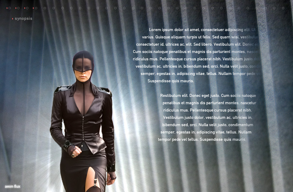
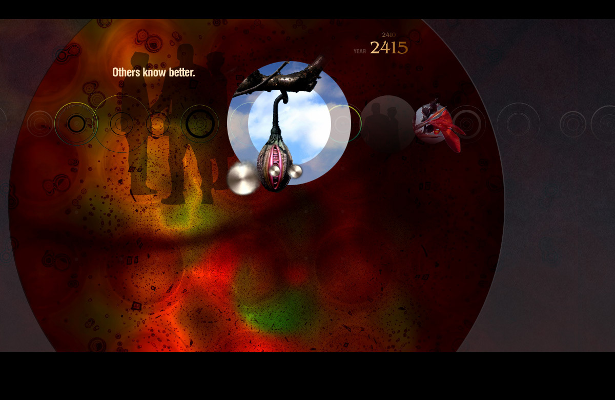
This initial sequence was from the teaser site for Paramount Picture's Aeon Flux. Built and animated in Flash, the navigation was a physics-powered organic feeling series of dots, inspired by some of Jared Tarbell's work, that brought in different scenes from the film. The whole idea was that in the future, when the story took place, humans had used up all the natural resources on planet Earth, so all manufactured materials were actually grown, such as bio-plastics made from algae. This aesthetic informed the art direction of the film and the designs I created.
This initial sequence was from the teaser site for Paramount Picture's Aeon Flux. Built and animated in Flash, the navigation was a physics-powered organic feeling series of dots, inspired by some of Jared Tarbell's work, that brought in different scenes from the film. The whole idea was that in the future, when the story took place, humans had used up all the natural resources on planet Earth, so all manufactured materials were actually grown, such as bio-plastics made from algae. This aesthetic informed the art direction of the film and the designs I created.
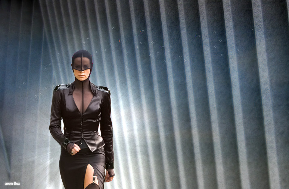
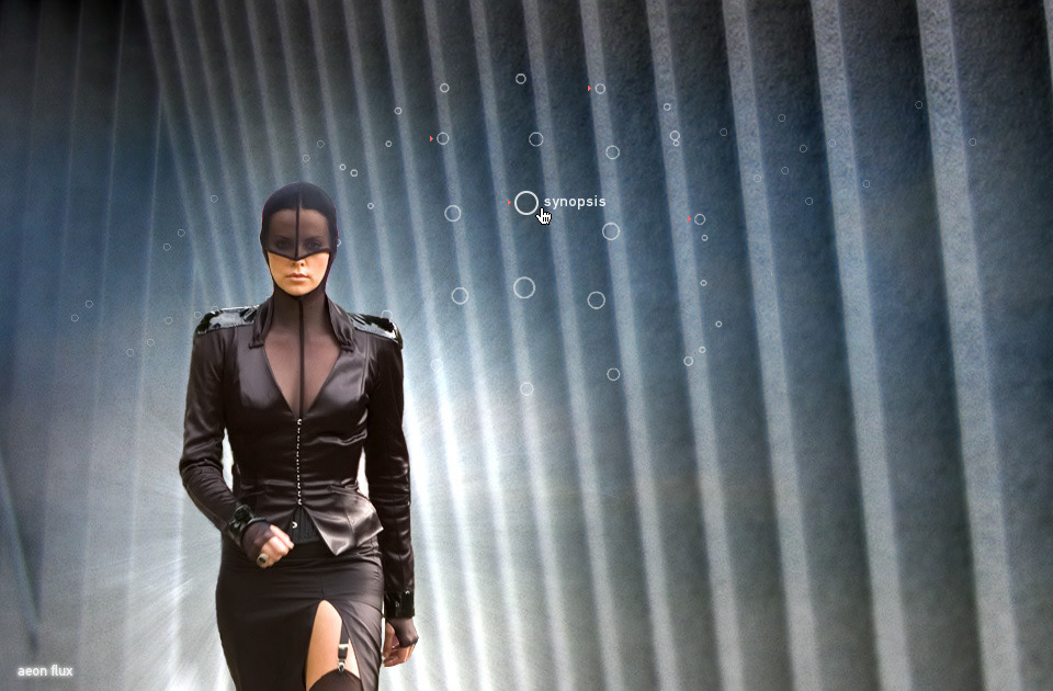
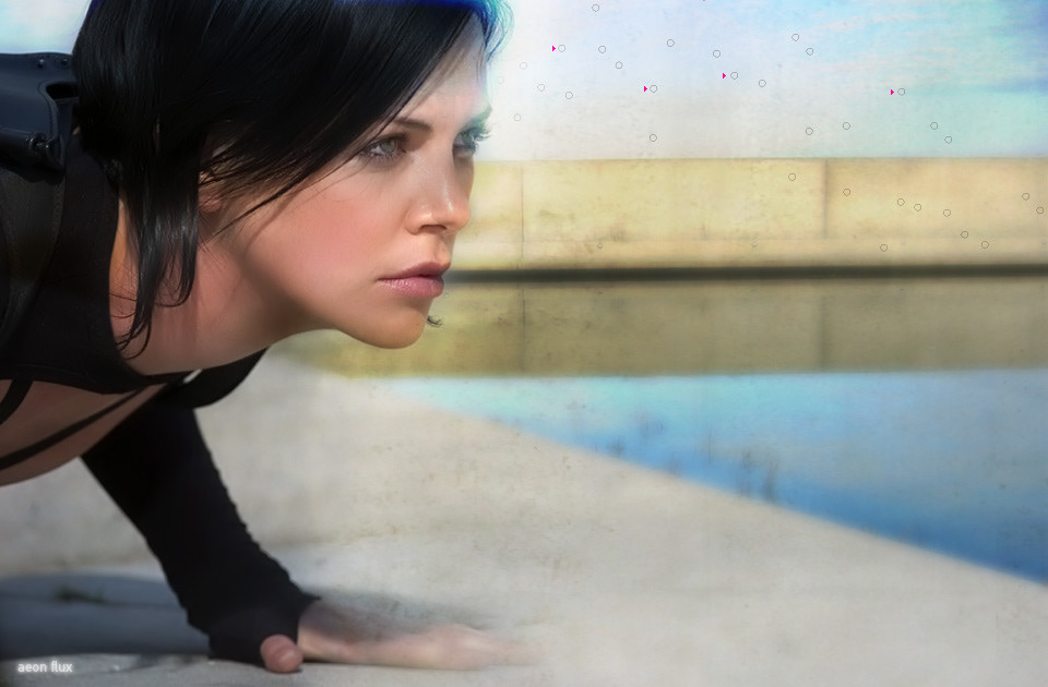
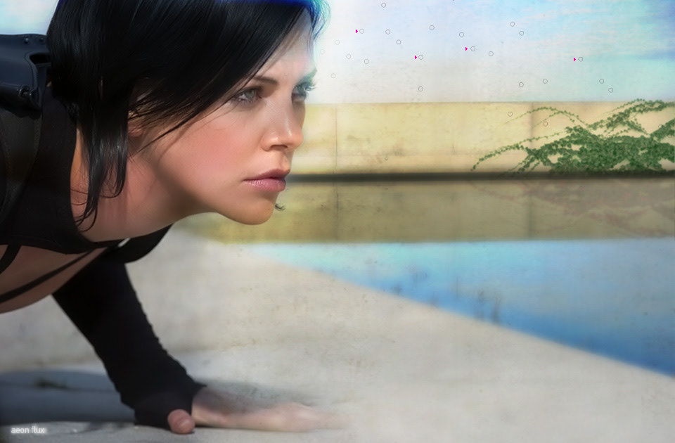
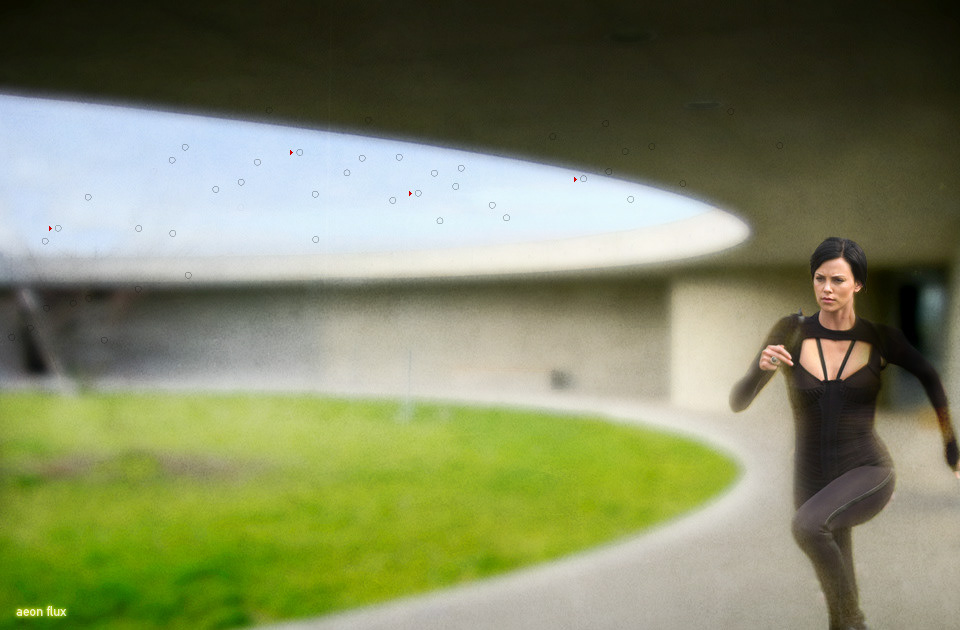
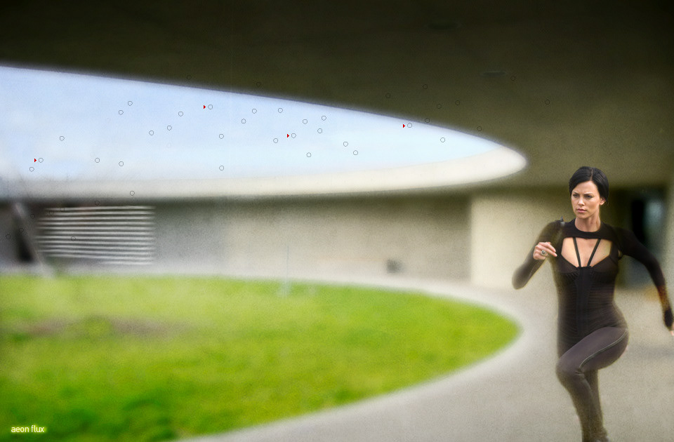

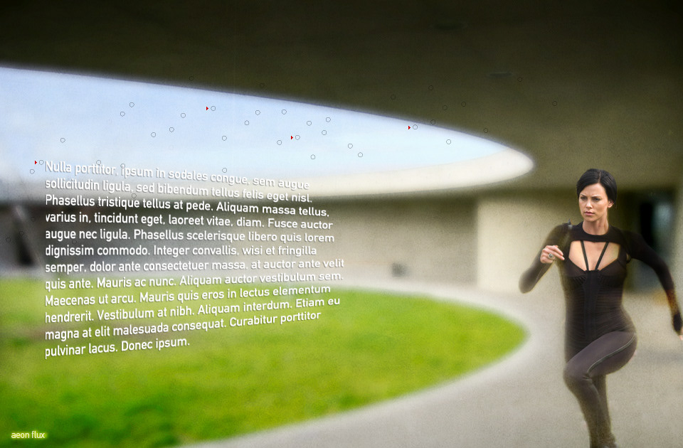
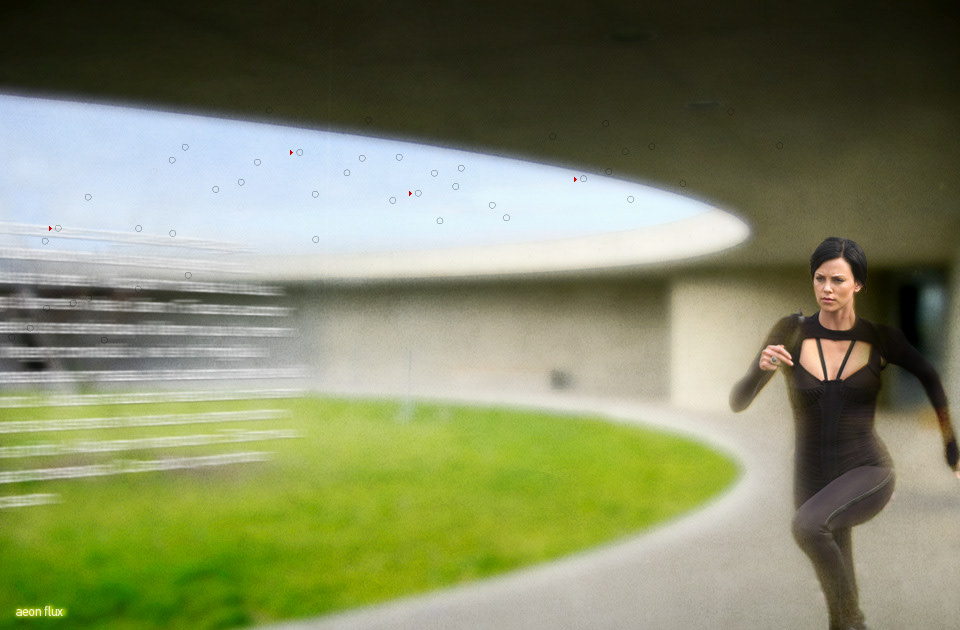

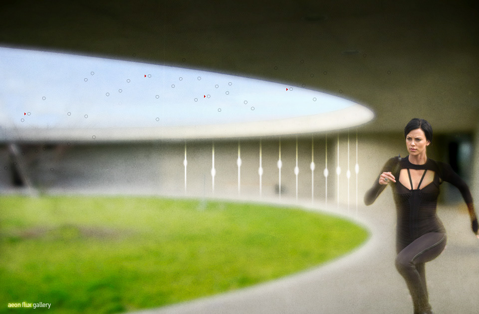
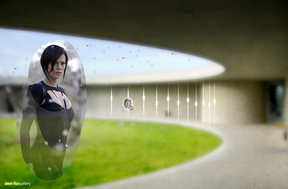
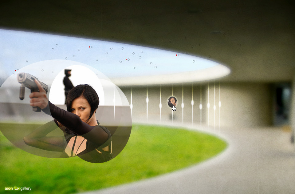
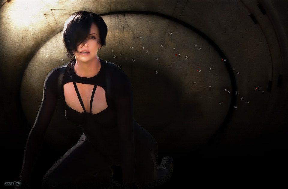
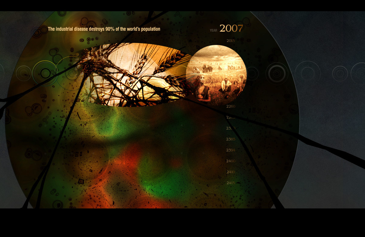
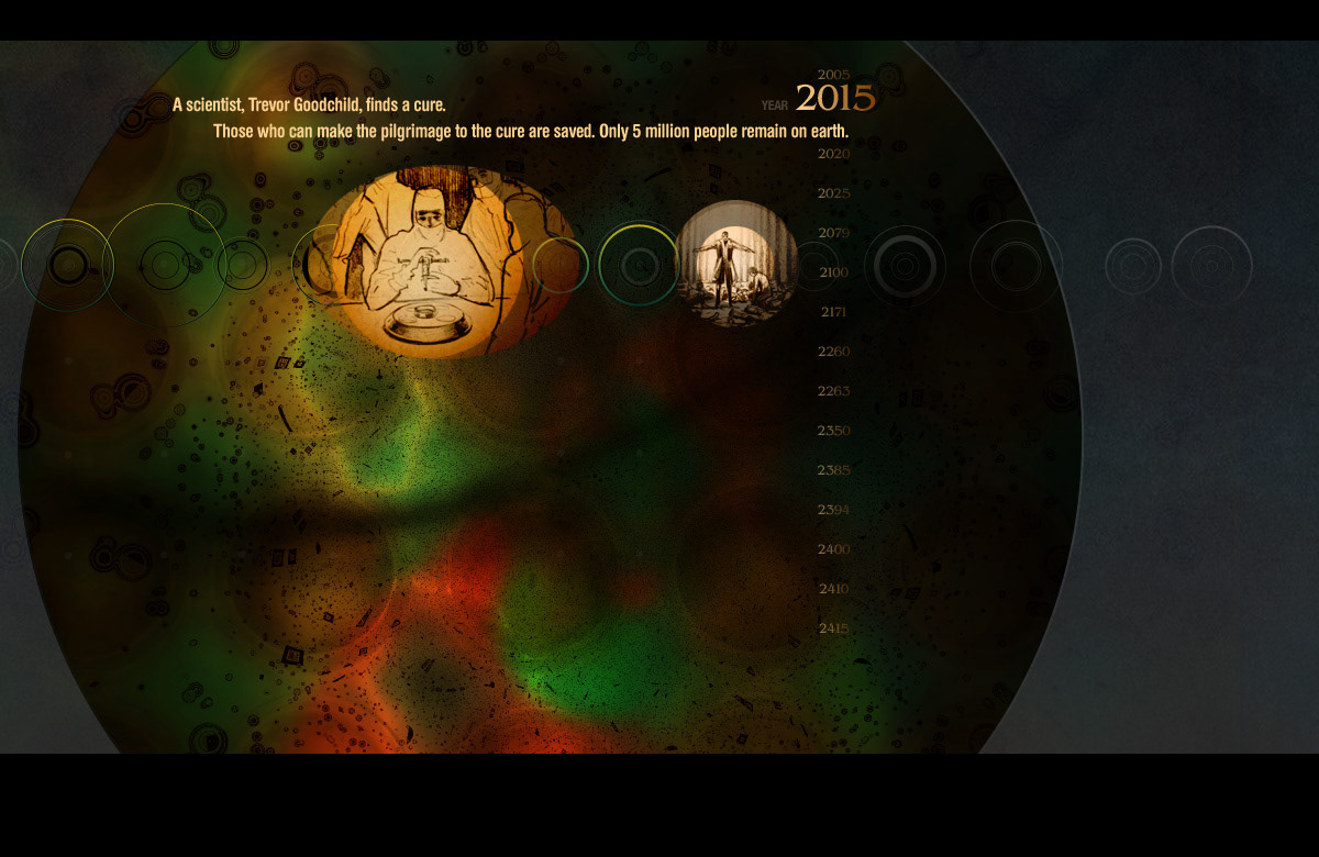
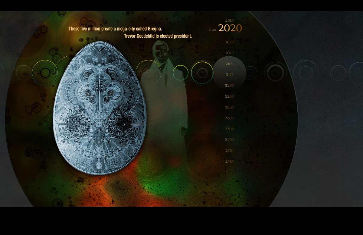
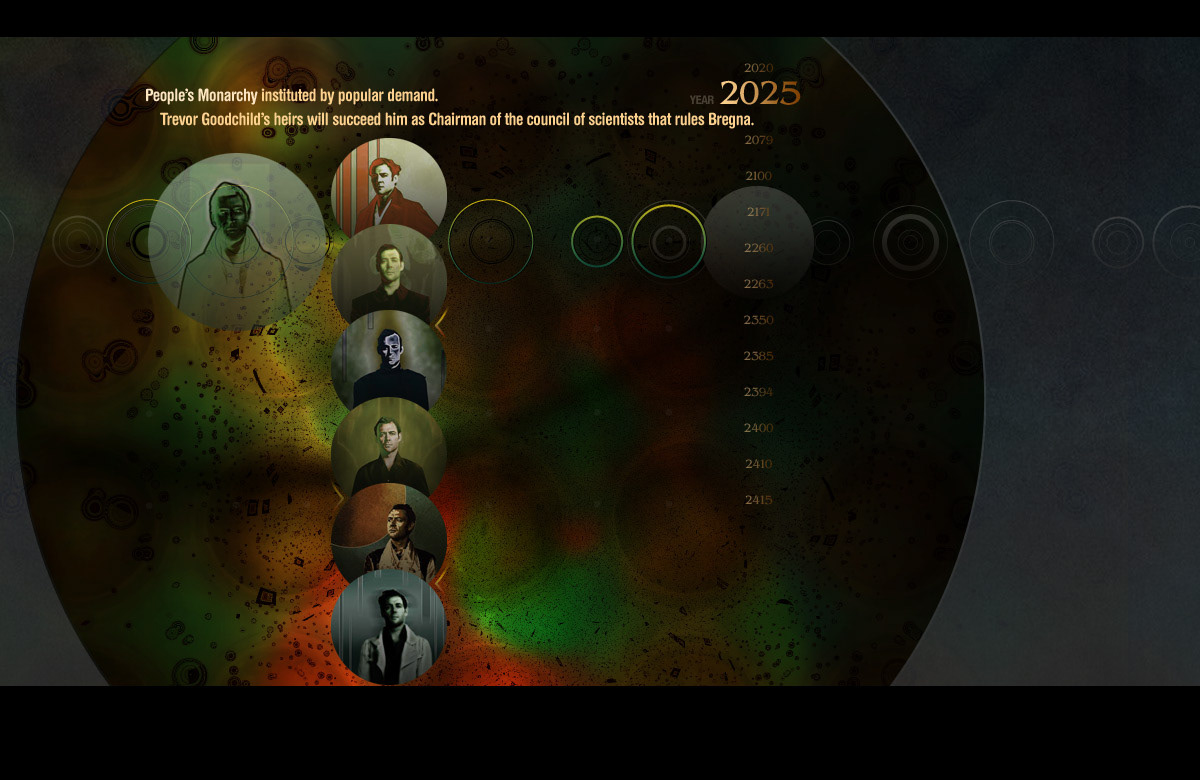
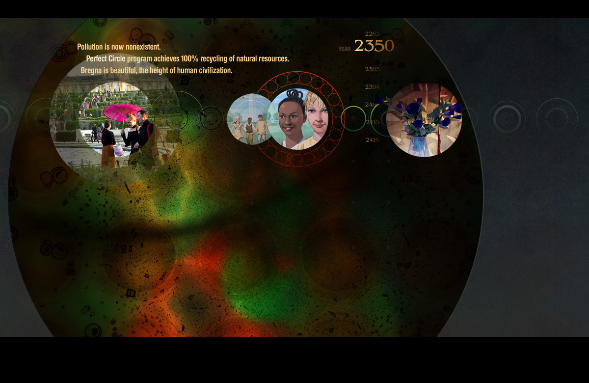
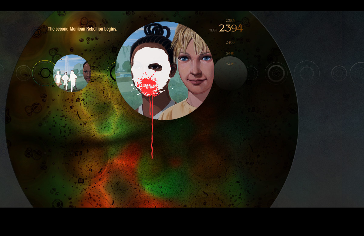
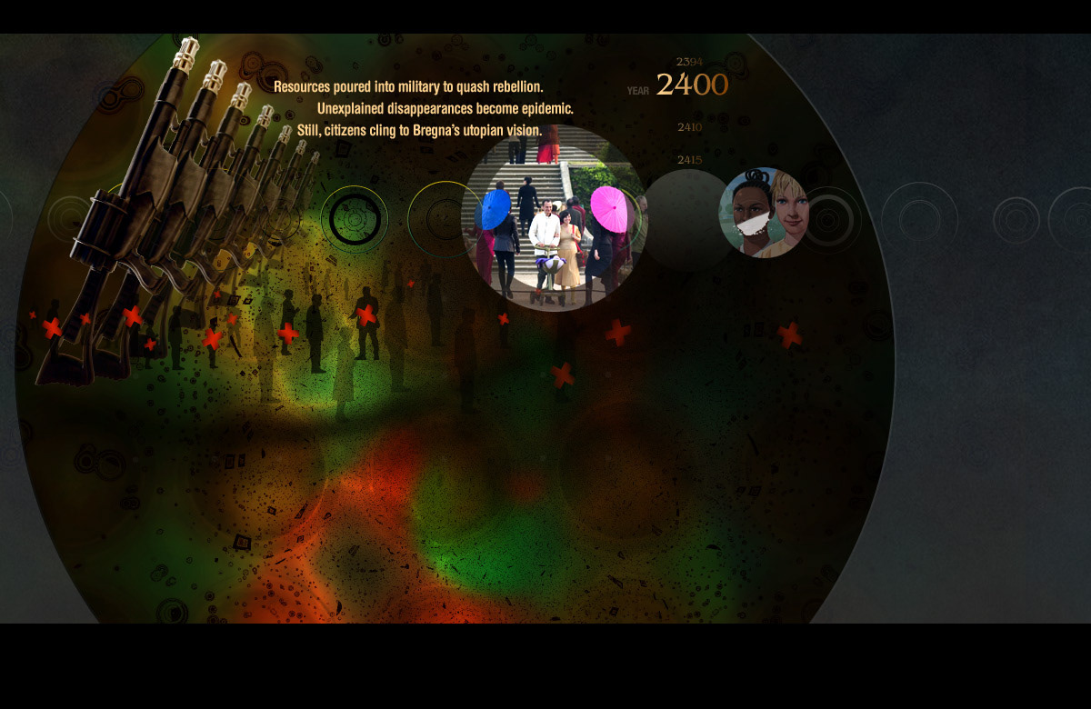
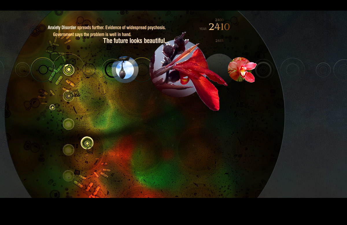
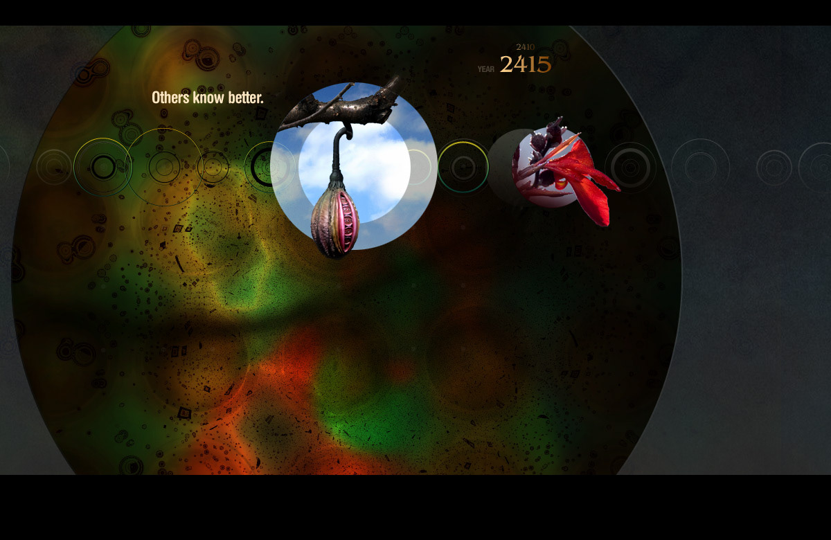
A little more Aeon Flux. These were the first of many steps of storyboard comps for a Timeline intro into the main theatrical marketing site, which later simply became a Feature because, as we all now know, nobody wants to sit through an intro! Again, launching off the organic foundation, the background was a molecular view that launched these spherical nodes that told the story. In the final version, all the perfect circles were replaced with dynamically generated oval shapes that undulated and were never the same.
STAR TREK
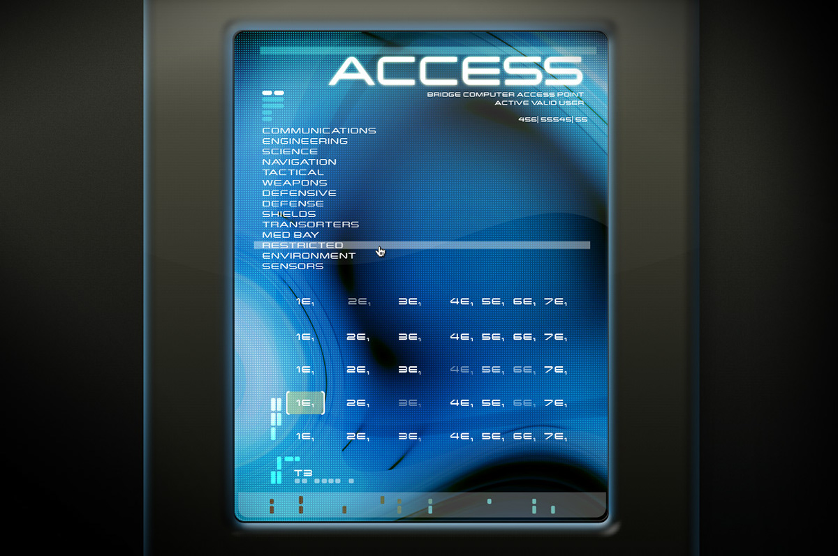
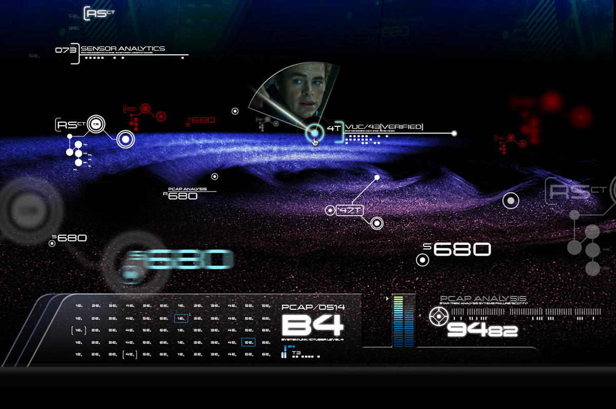
These screens were part of a social campaign that accompanied the Star Trek Into Darkness film website my team and I created—these screens were modeled after interfaces from the film. I built these as entry points into what would be part of an immersive experience to reveal some hidden imagery from the upcoming release as an easter egg type hunt.
These screens were part of a social campaign that accompanied the Star Trek Into Darkness film website my team and I created—these screens were modeled after interfaces from the film. I built these as entry points into what would be part of an immersive experience to reveal some hidden imagery from the upcoming release as an easter egg type hunt.
JACK RYAN
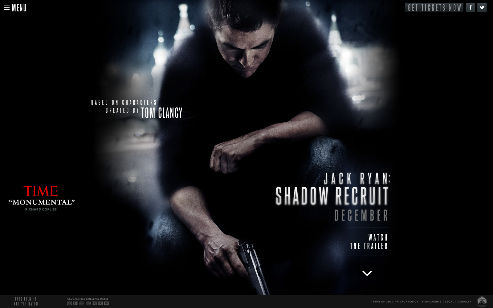
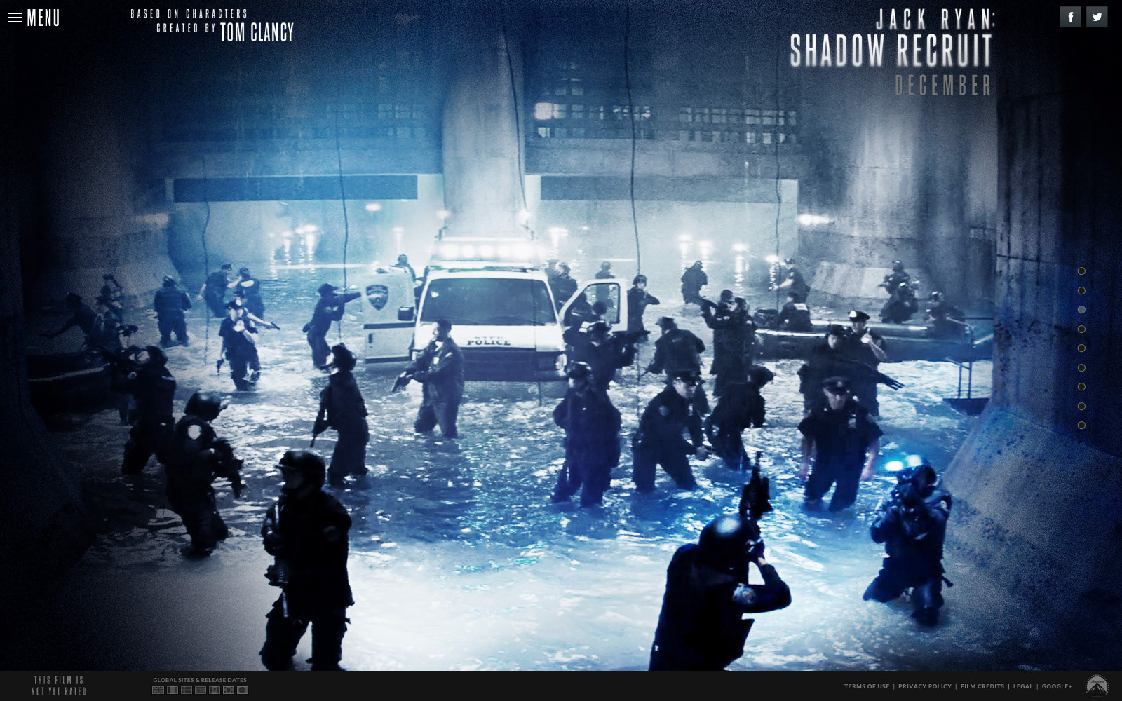
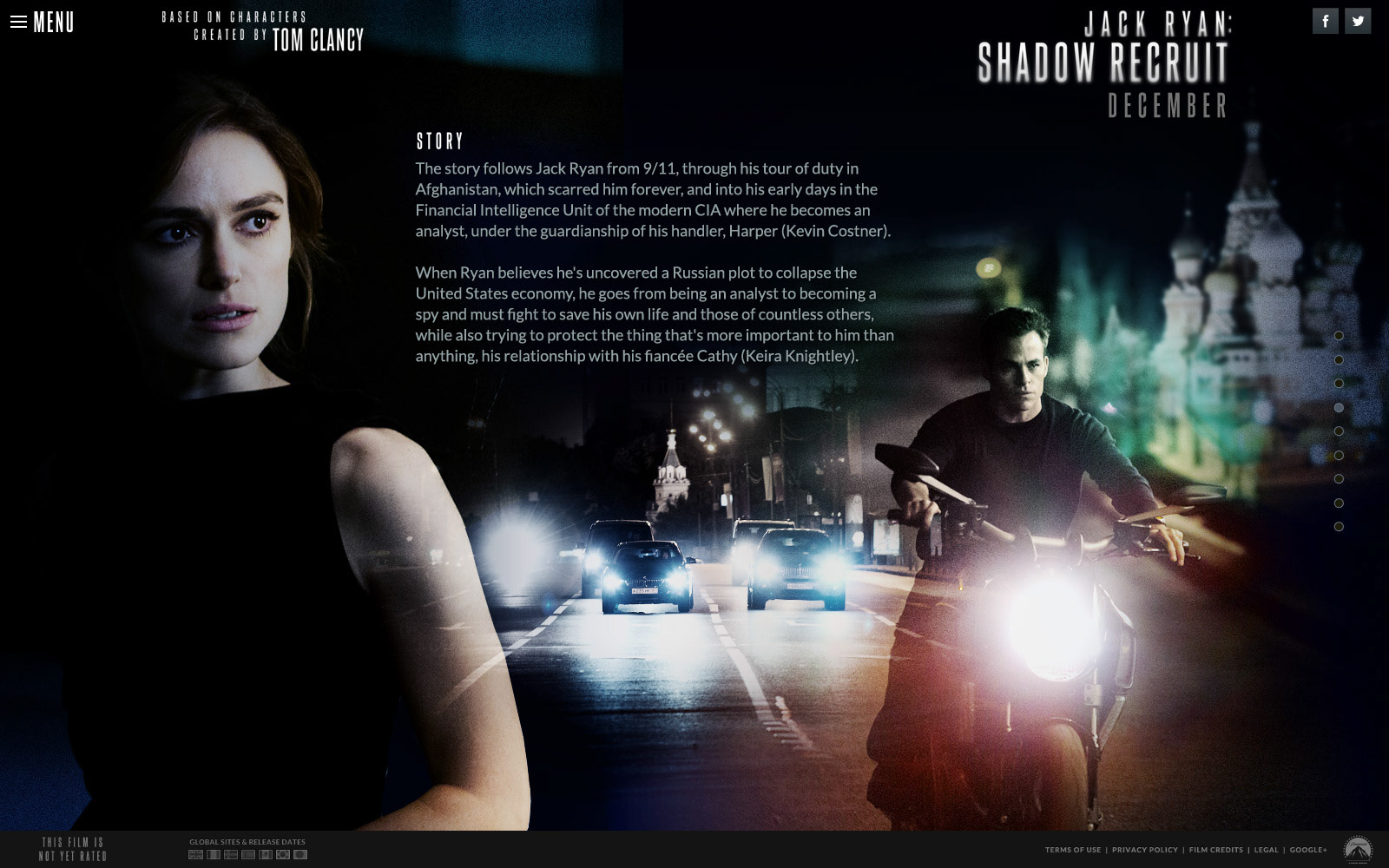
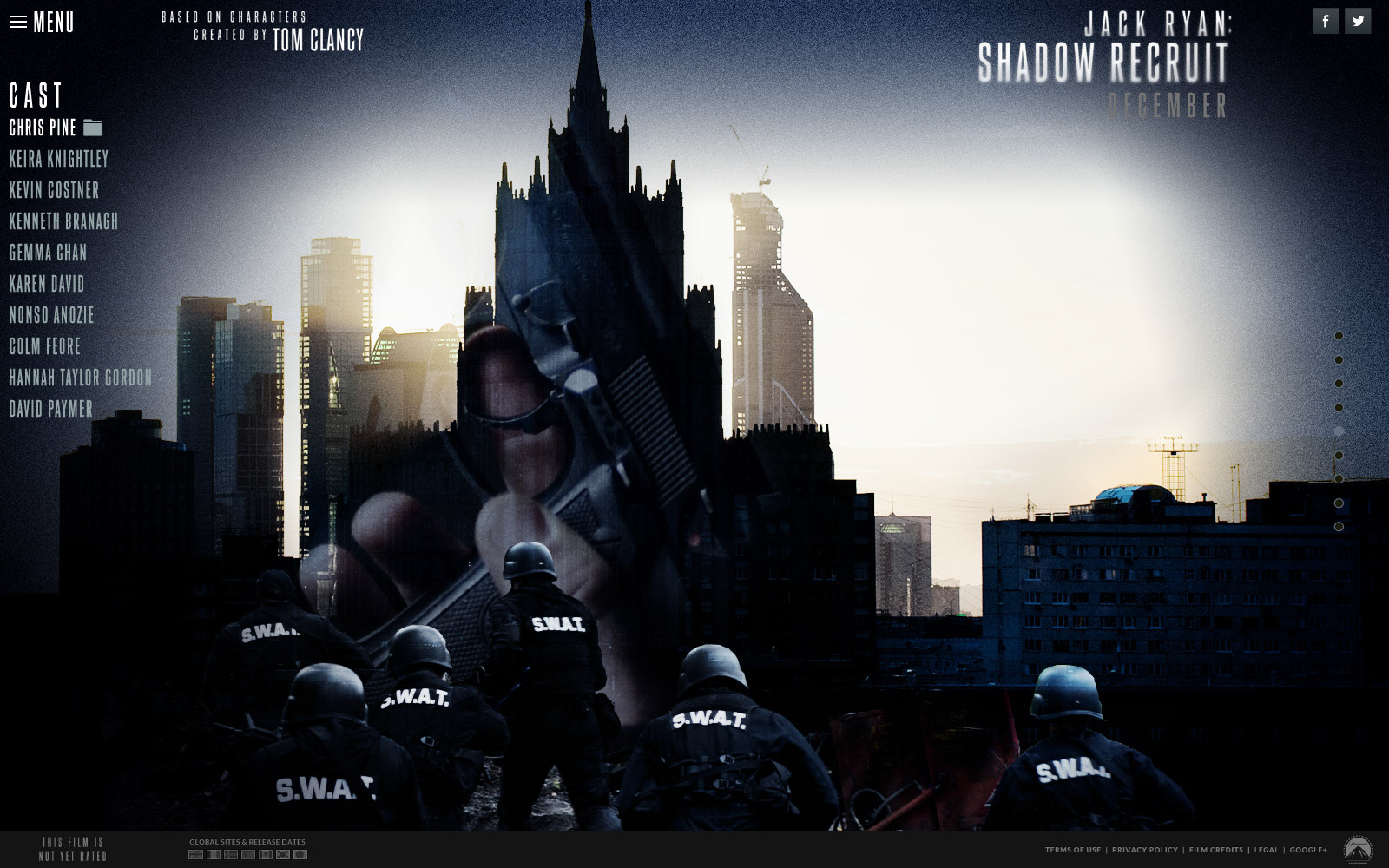
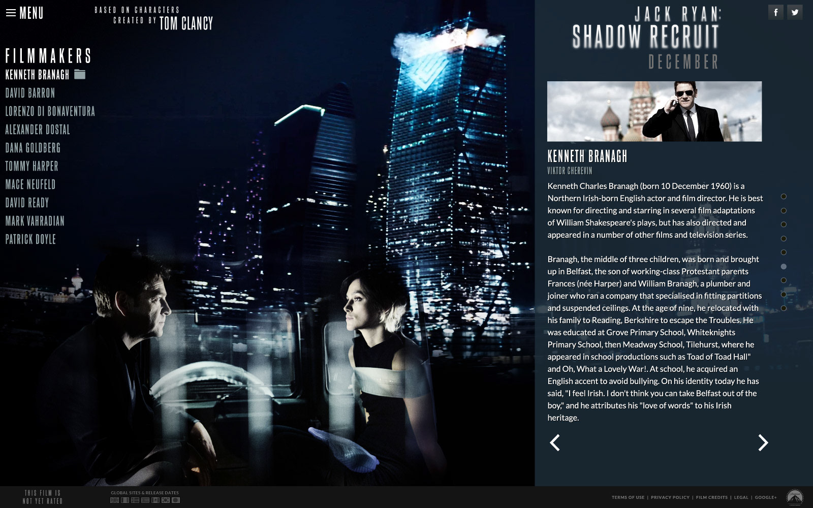
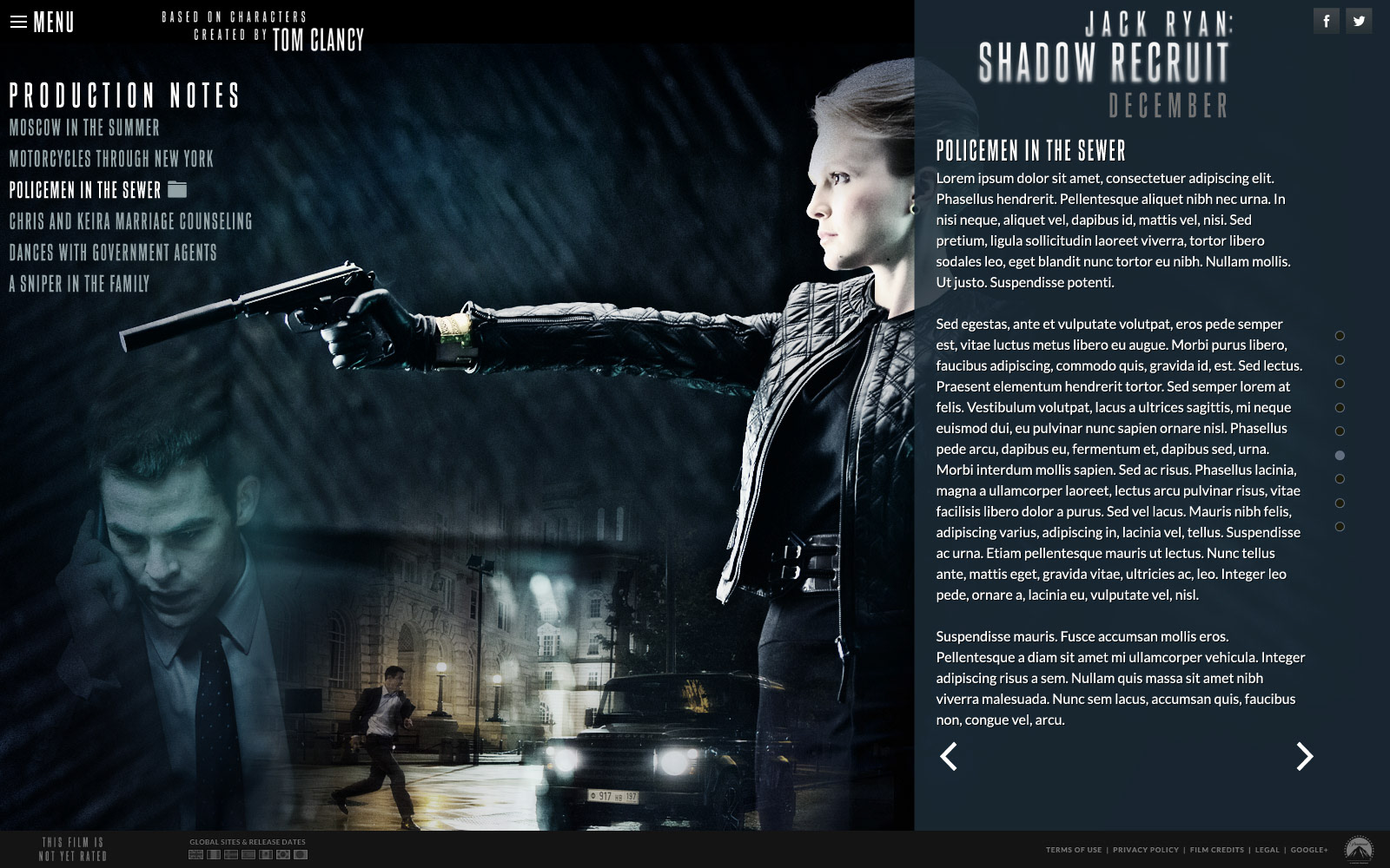
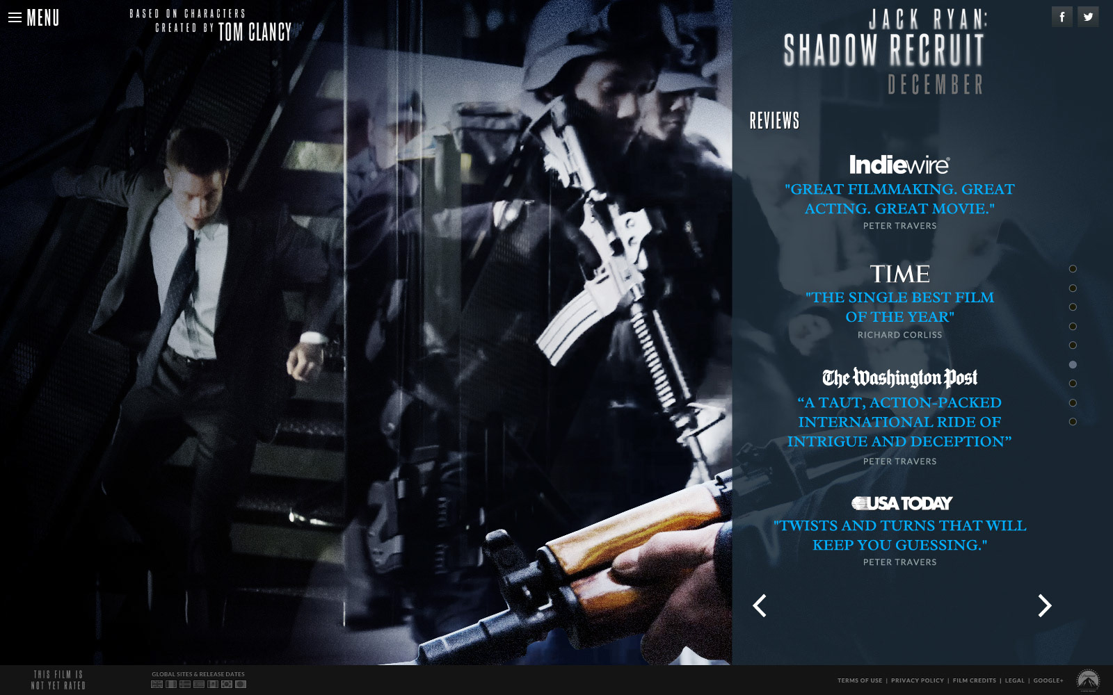
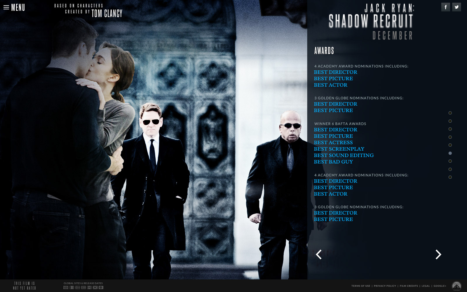
The video below is a motion graphics sequence that created the backdrop for the movie site for Jack Ryan. The thumbnails below show how the content rendered over that in the early days of HTML5 on desktop browsers. One of the things that was a lot of fun in film marketing was taking on-set photography (unit photography is the production term) and creating photo collages to build rich layered visuals with depth.
The video below is a motion graphics sequence that created the backdrop for the movie site for Jack Ryan. The thumbnails below show how the content rendered over that in the early days of HTML5 on desktop browsers. One of the things that was a lot of fun in film marketing was taking on-set photography (unit photography is the production term) and creating photo collages to build rich layered visuals with depth.
Jack Ryan background sequence.
KILL BILL Vol I
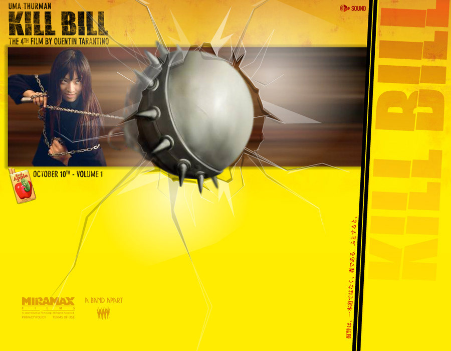
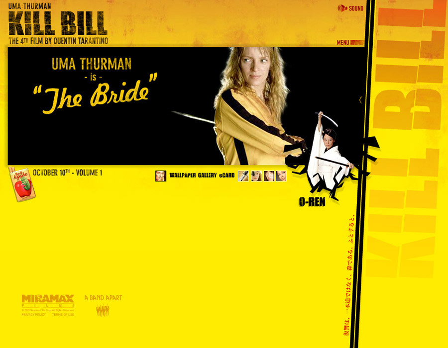
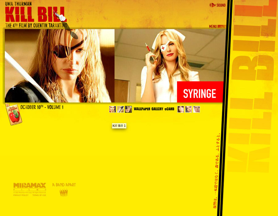
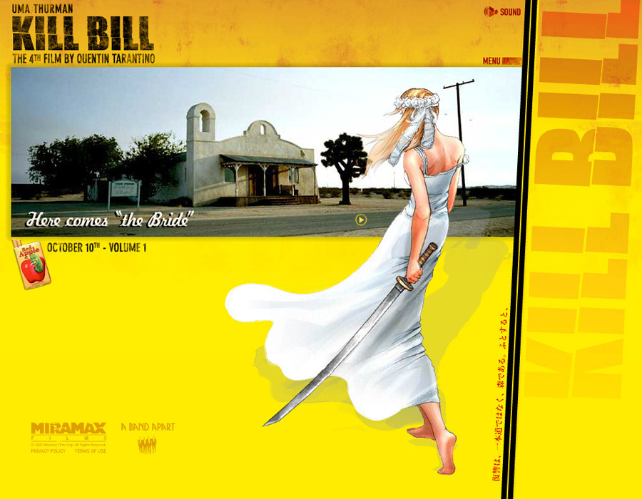
There was so much to love about working on Quentin Tarantino's Kill Bill I & II, but one of my favorite little pieces was the homage to Hatori Hanzo, the master sword maker who crafted the sword that the Bride would have her revenge with. For the teaser site, we created a little animated vignette where the blade would elegantly float outside the browser's boundaries. When certain areas were tapped, a quote would appear, along with its translation, as a tease of things to come.
There was so much to love about working on Quentin Tarantino's Kill Bill I & II, but one of my favorite little pieces was the homage to Hatori Hanzo, the master sword maker who crafted the sword that the Bride would have her revenge with. For the teaser site, we created a little animated vignette where the blade would elegantly float outside the browser's boundaries. When certain areas were tapped, a quote would appear, along with its translation, as a tease of things to come.
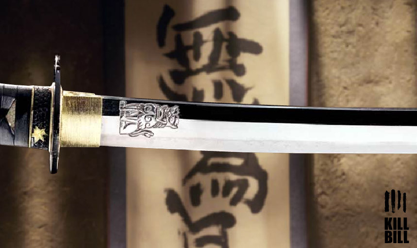
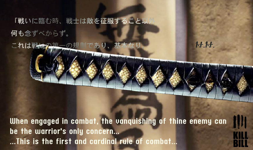
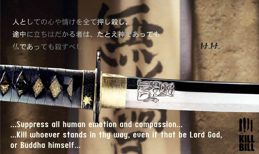
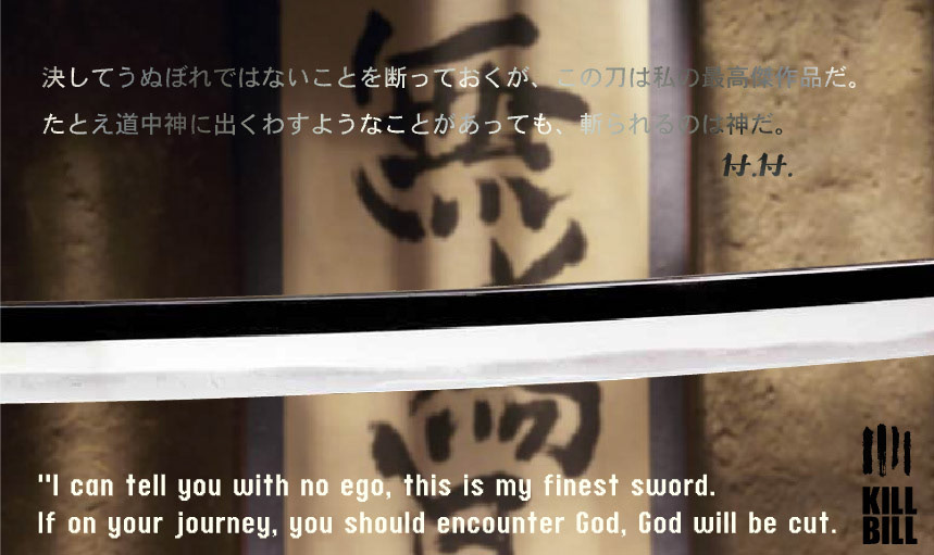
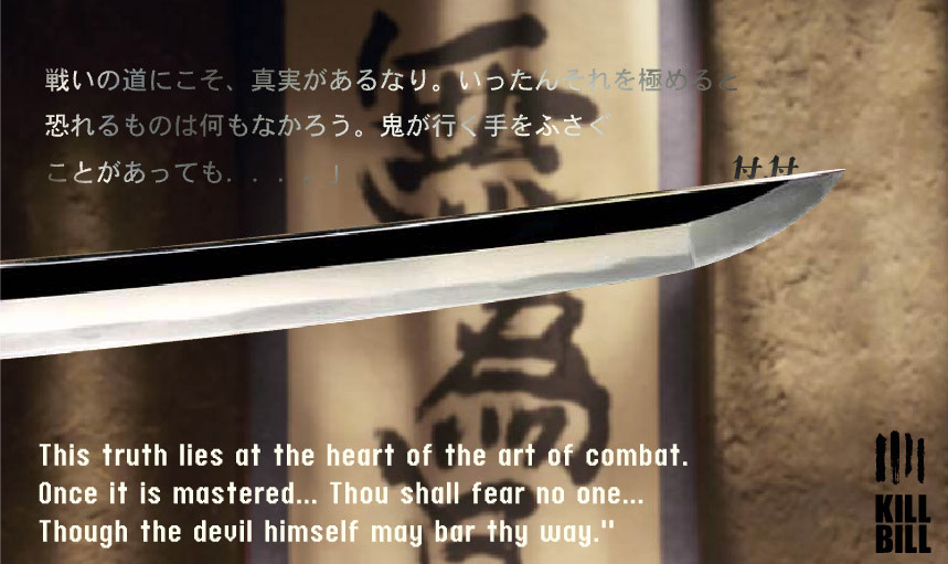
Top the katana sword off with flying syringes that fill typography with blood, Gogo Yubari's spiked ball crashing into the user's screen, popup character, and graphic novel-style illustrations, all nodding to the film's stylistic and emotional power. It was truly a team effort that sang with emotion, animation, sound effects, and creativity.
THE LOVELY BONES
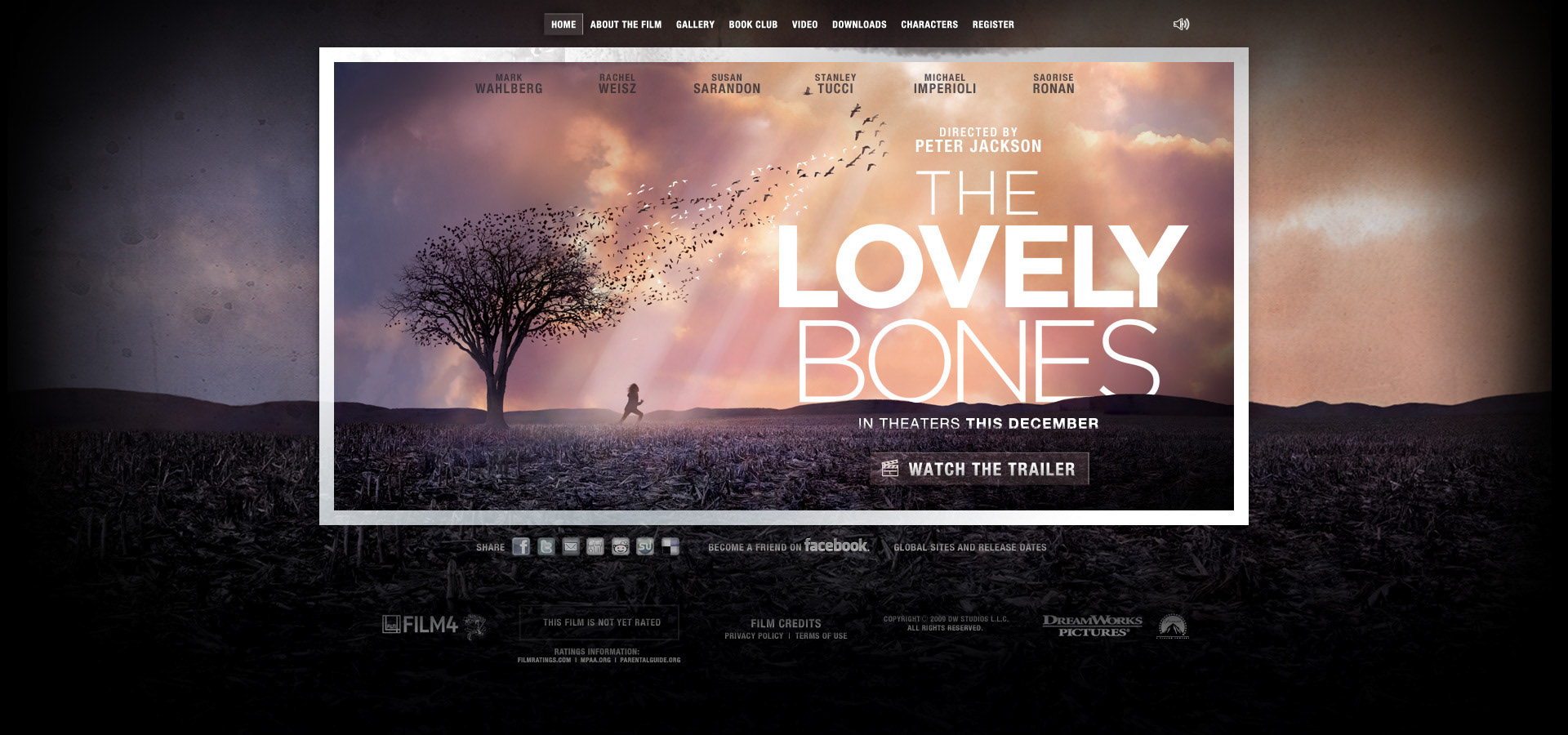
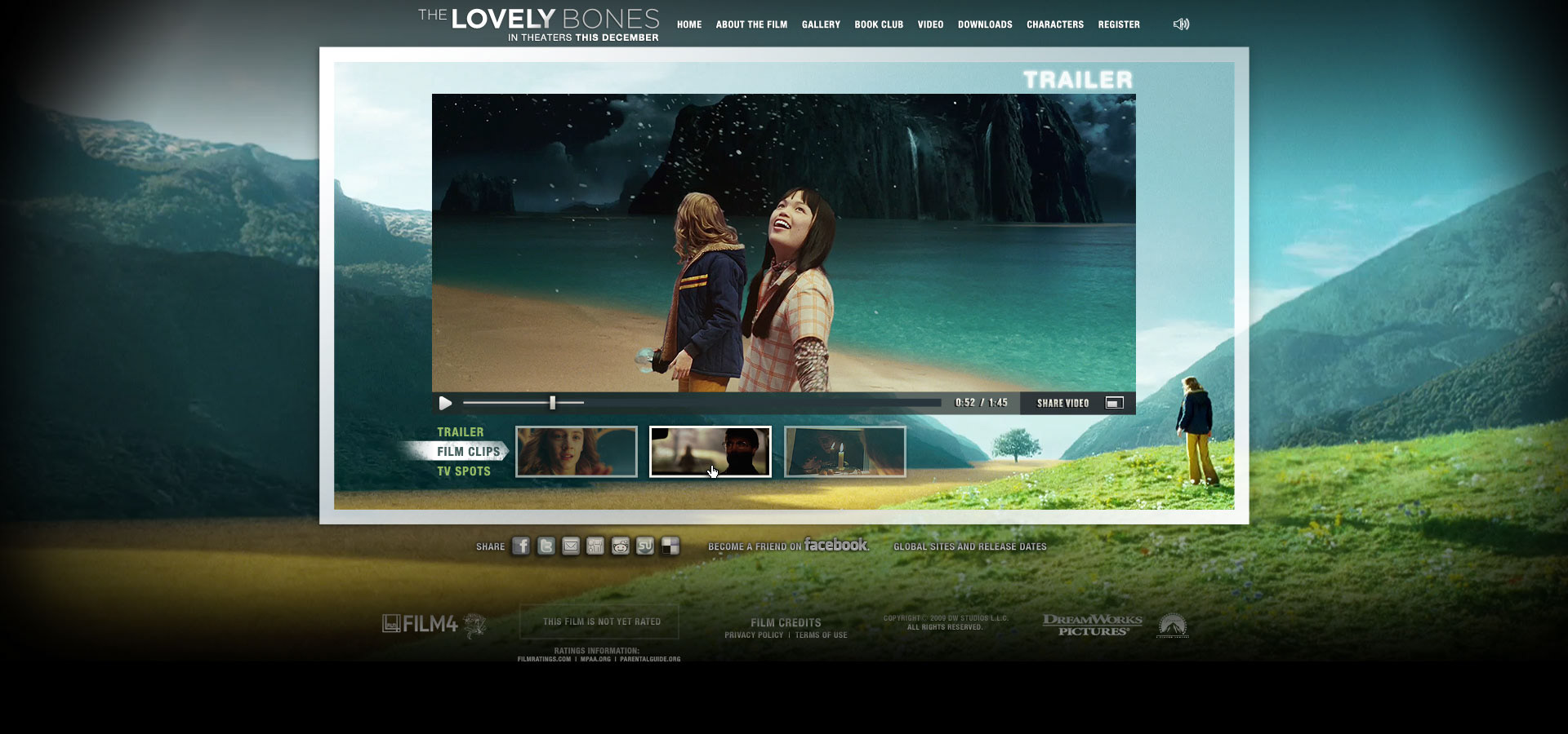
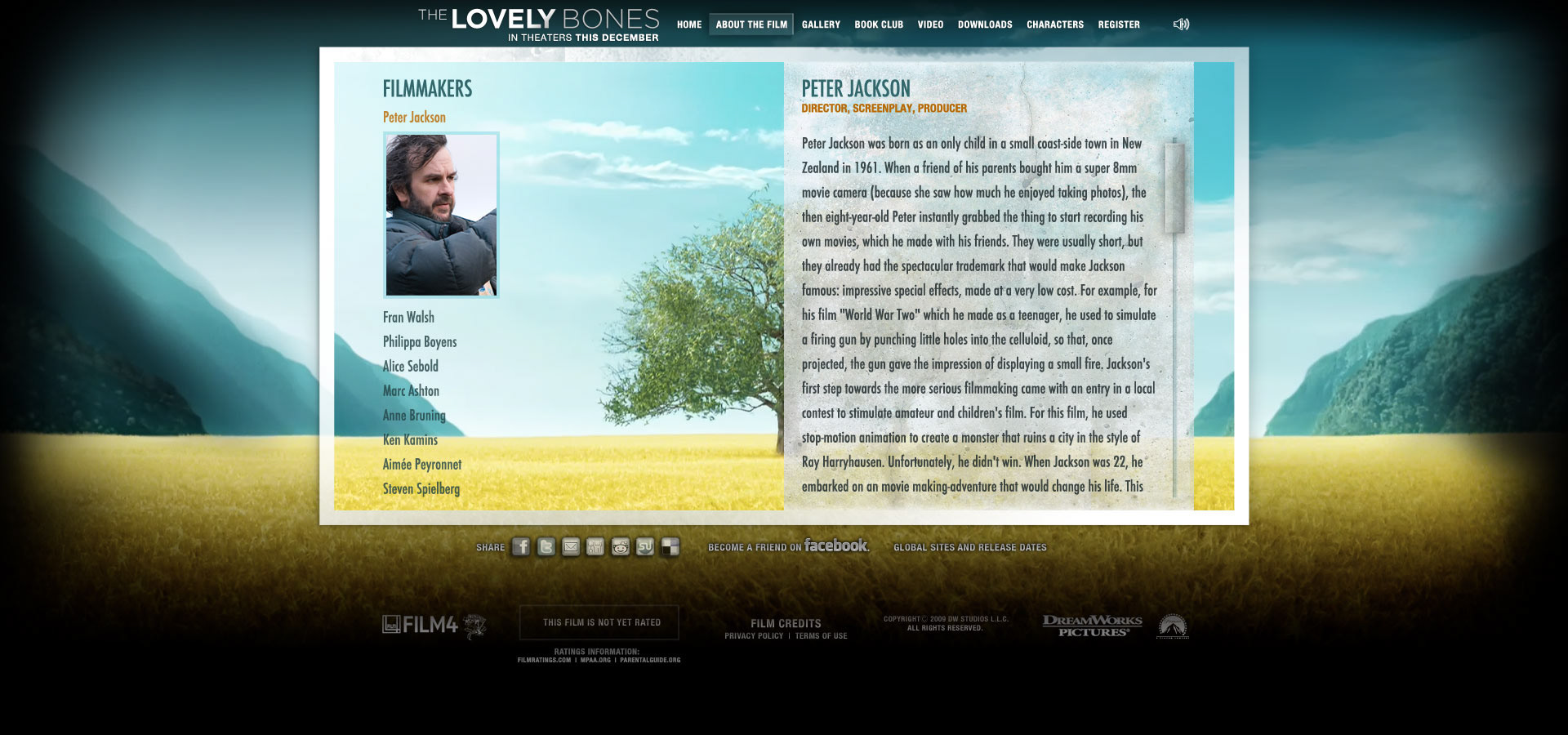
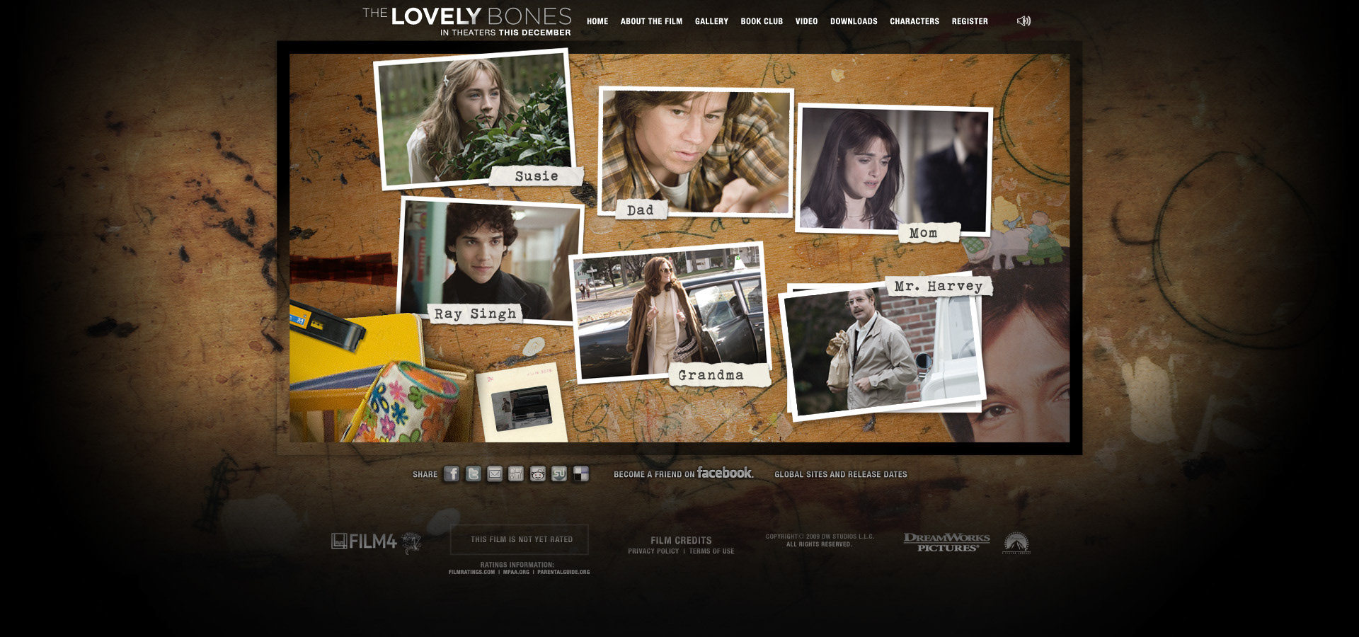
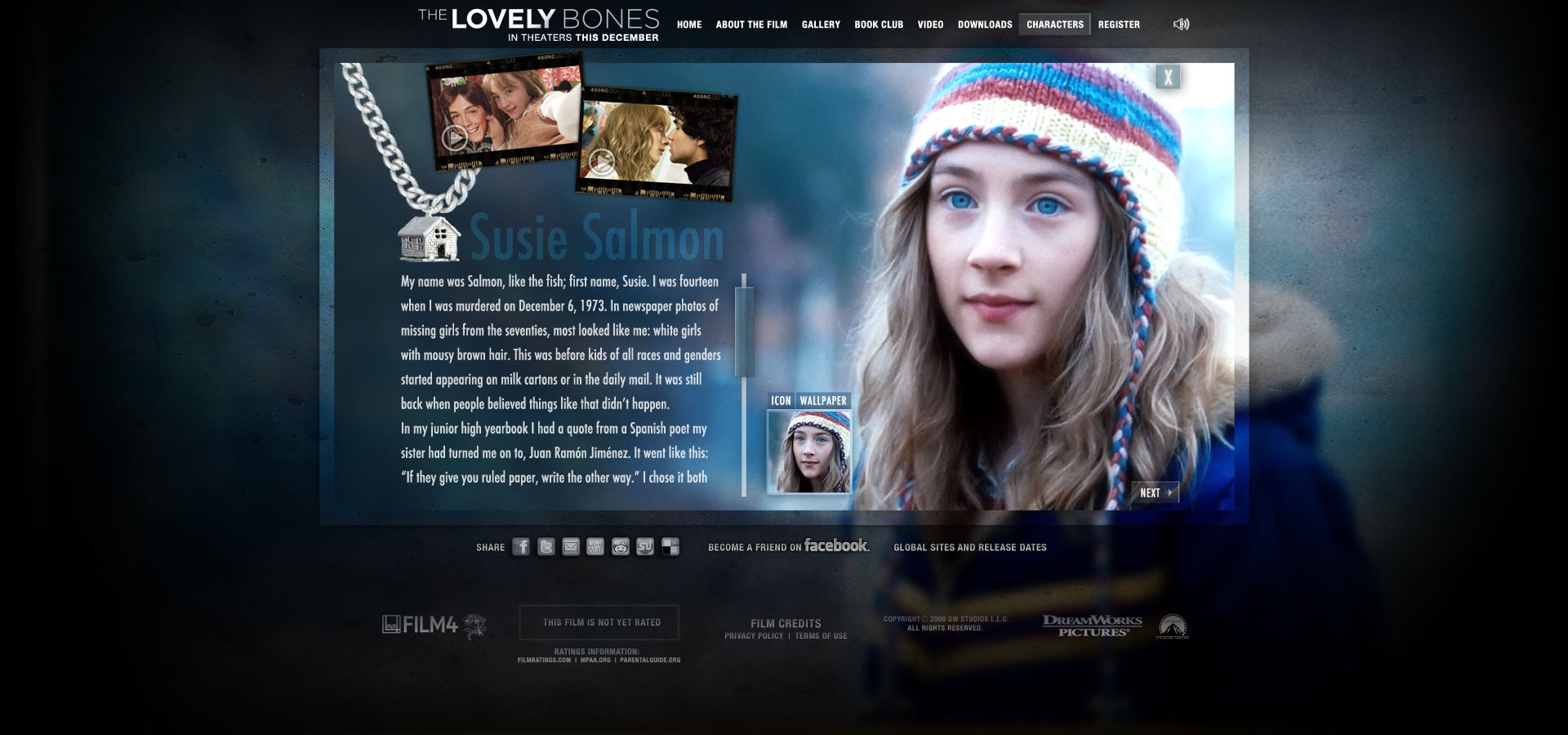
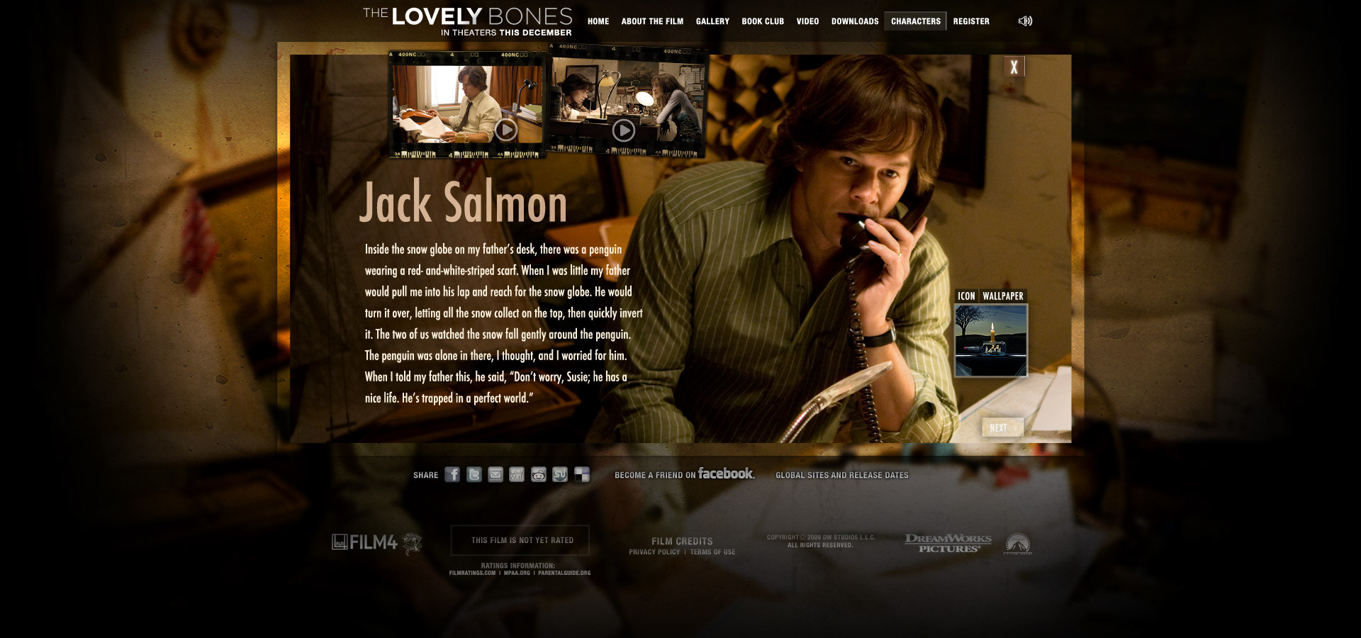
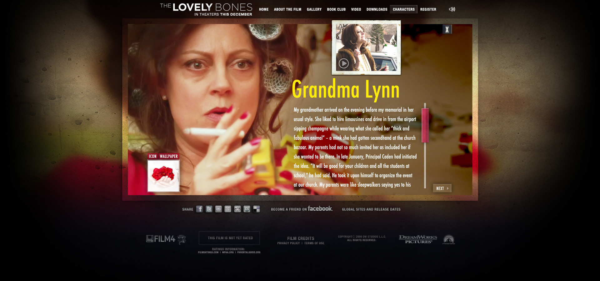
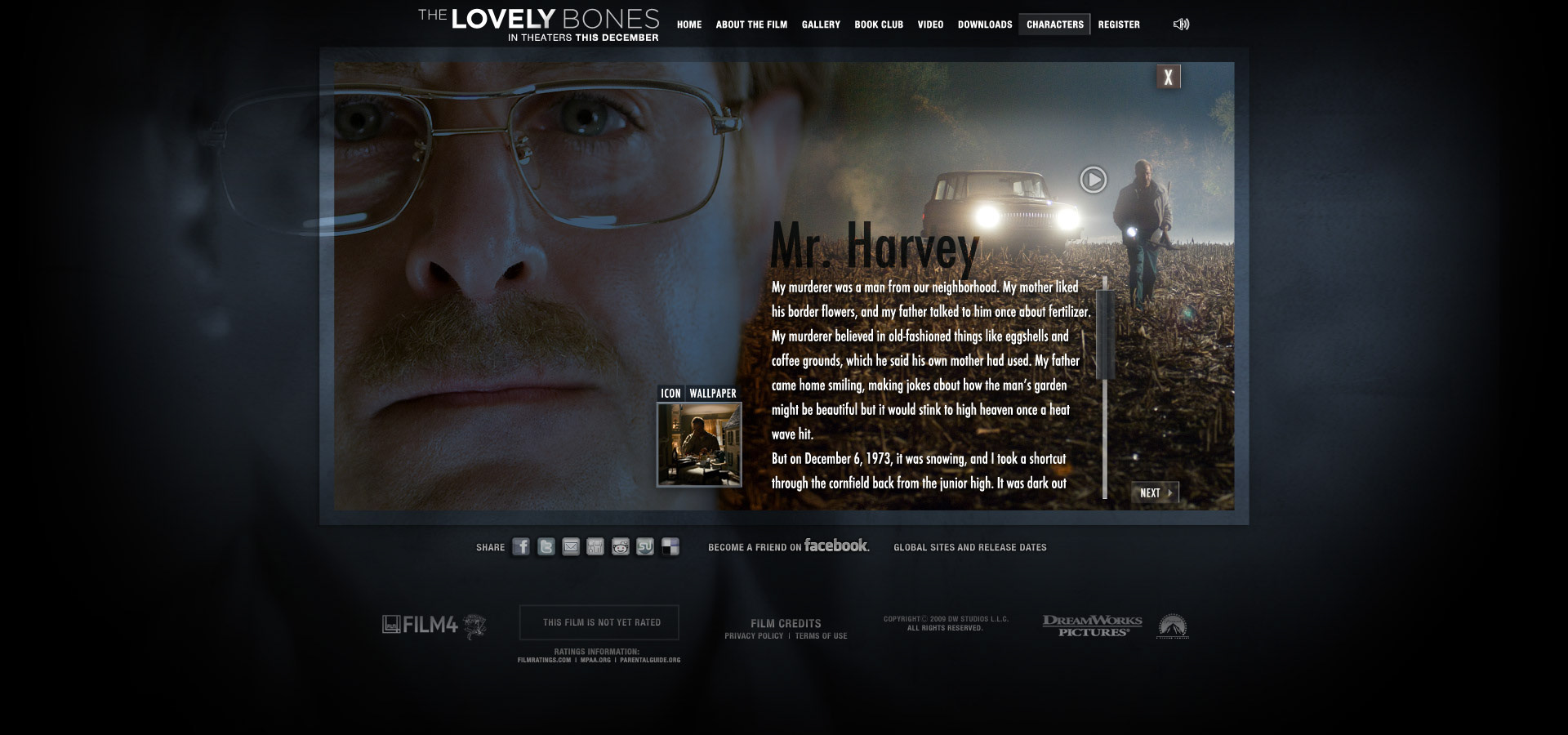
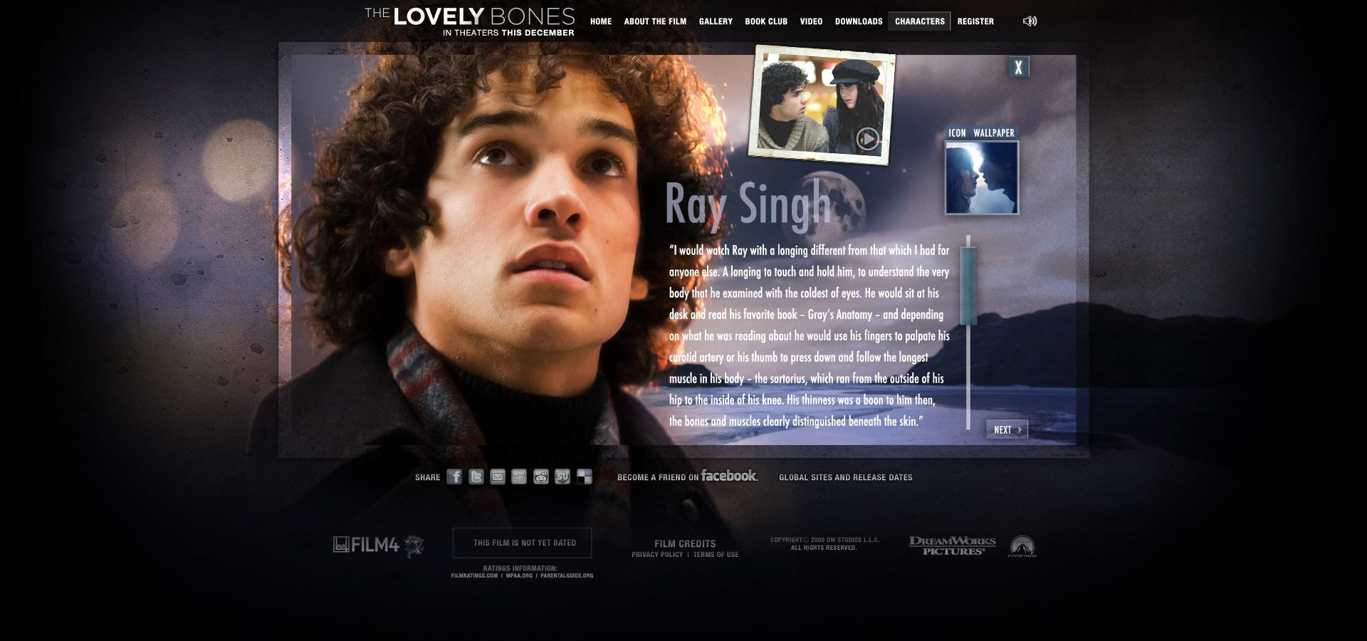
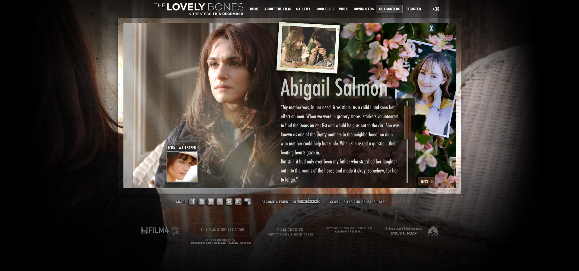
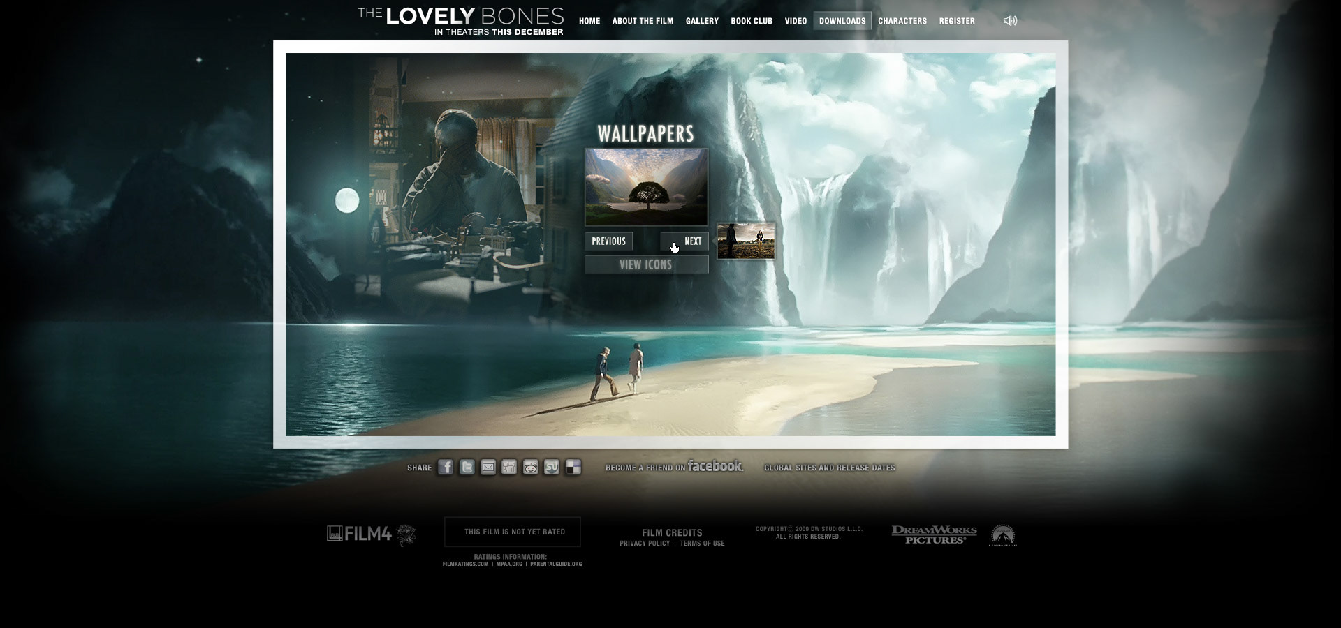
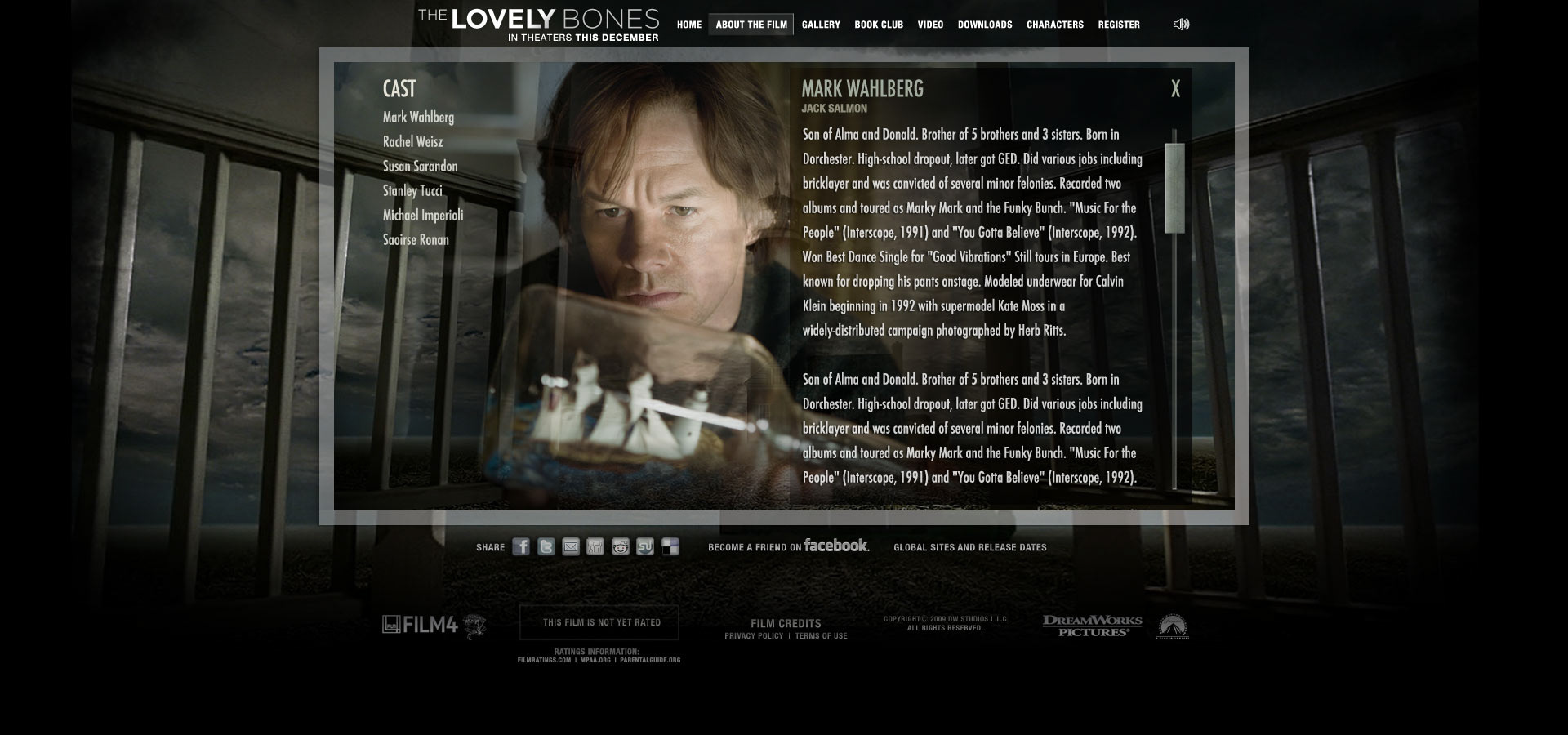
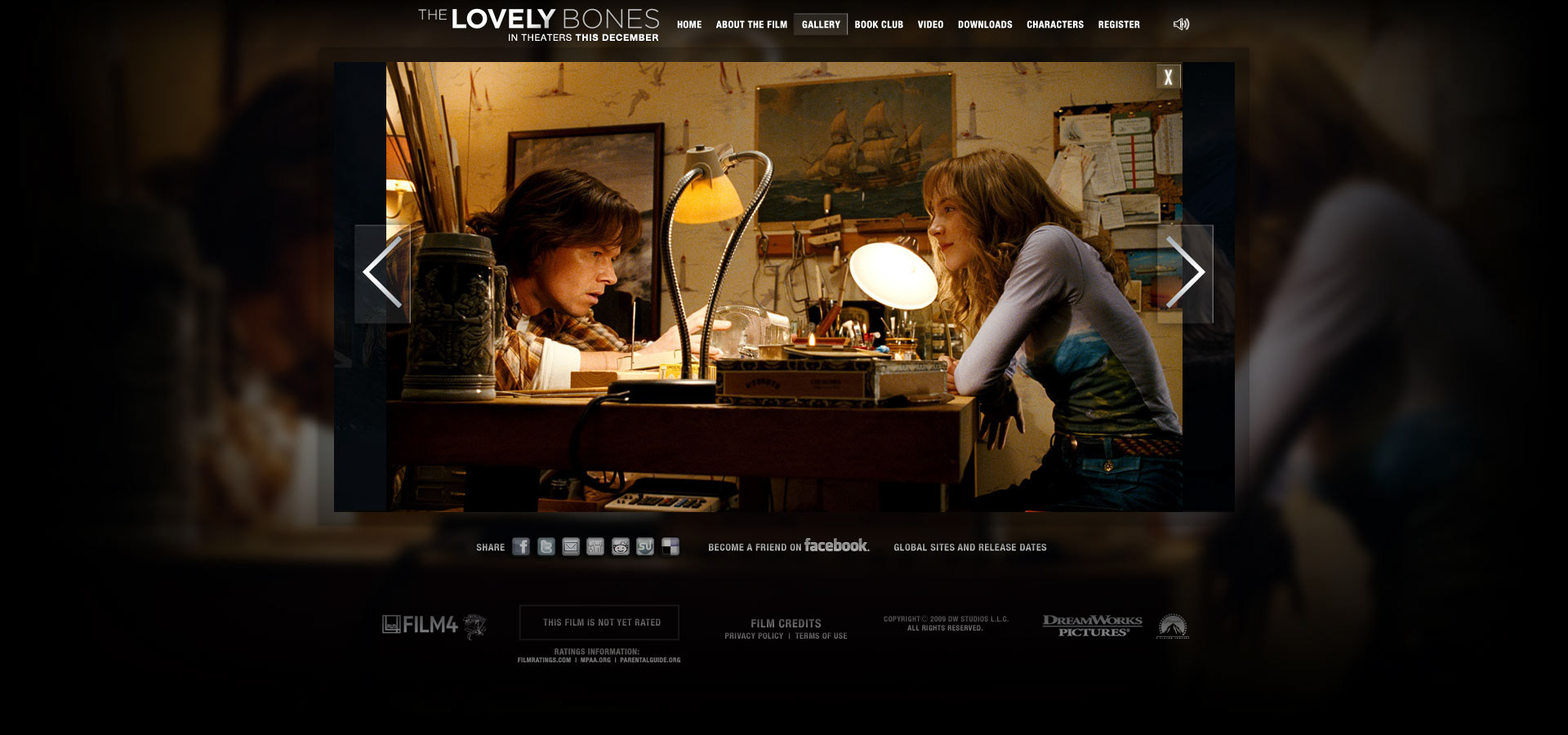
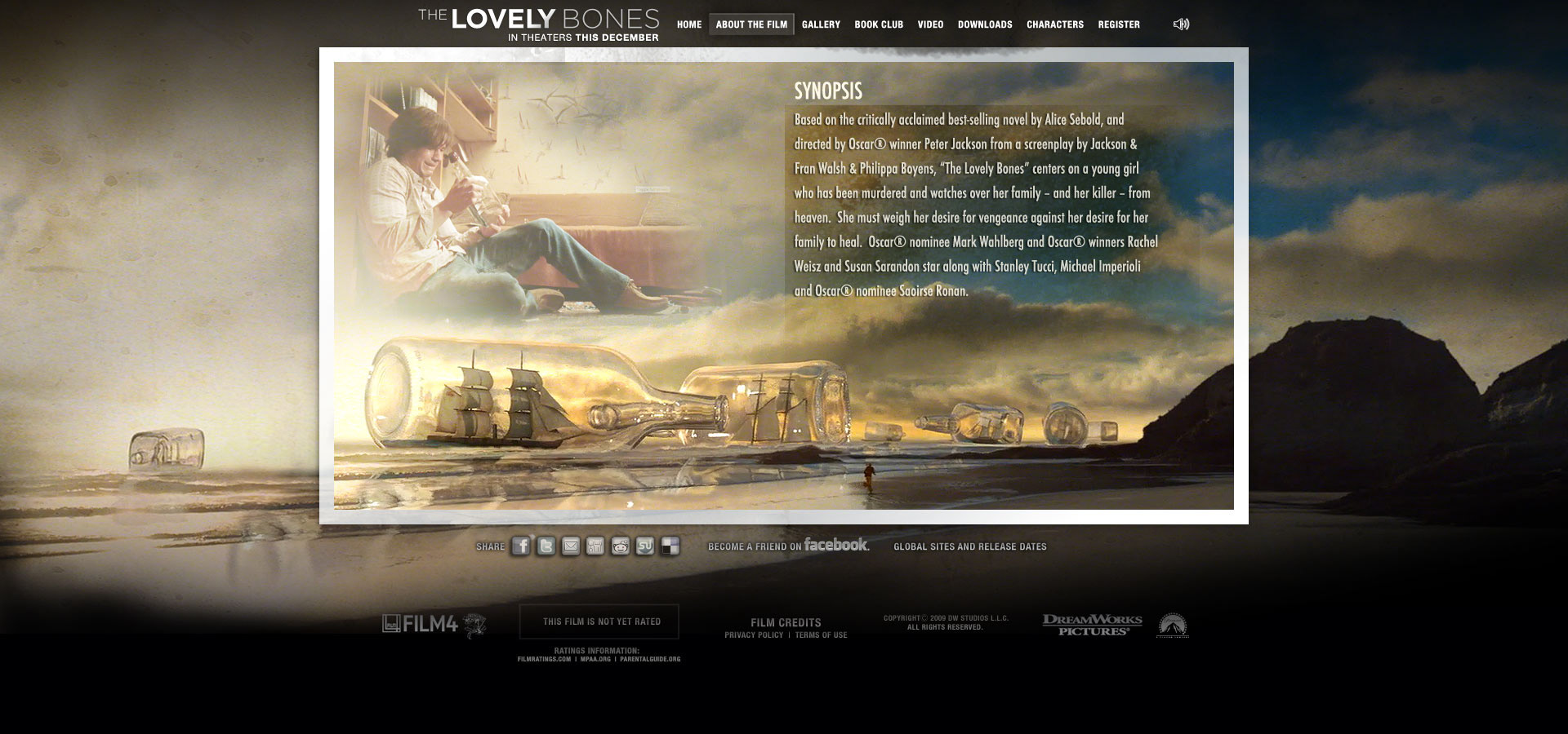
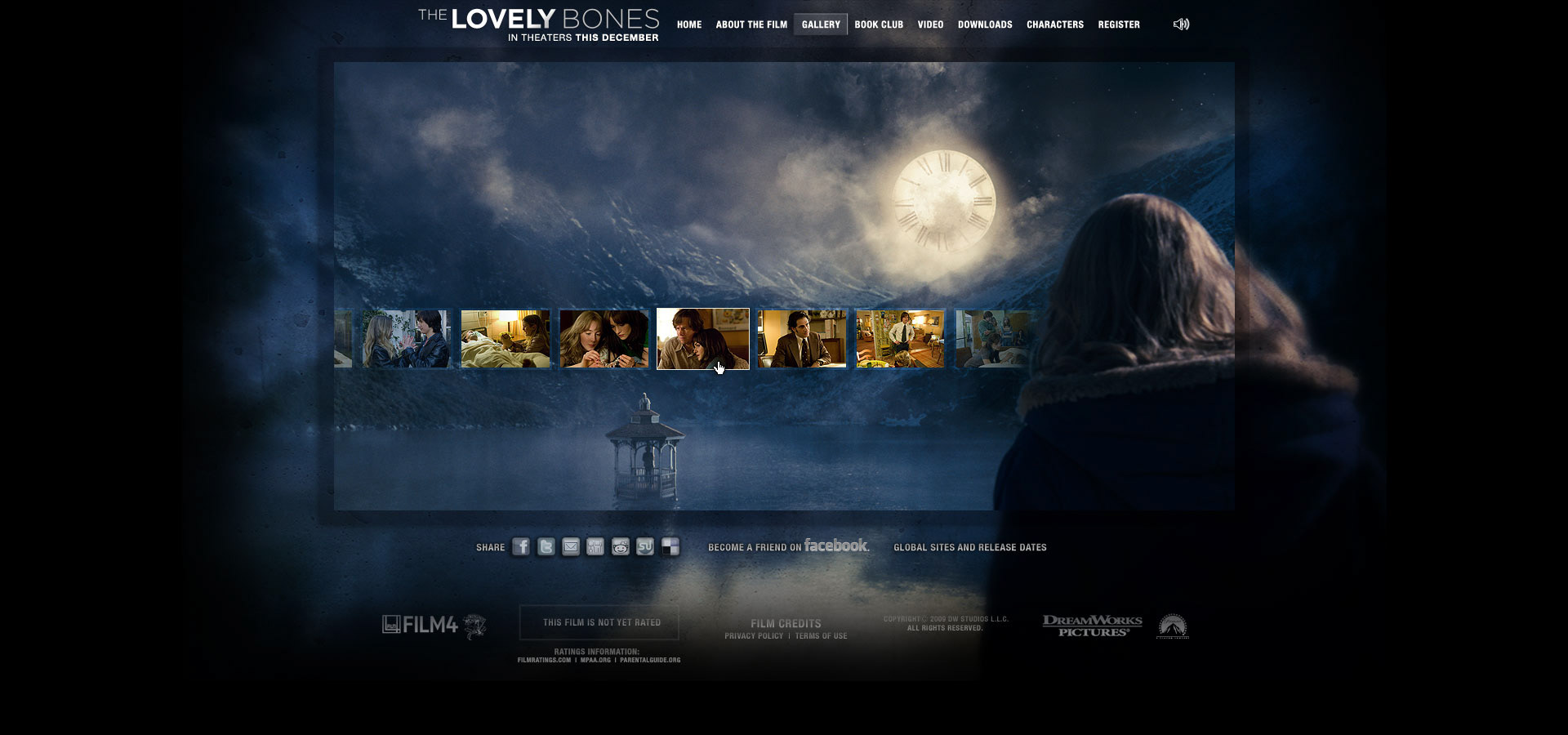
Peter Jackson adapted Alice Sebold's powerful book into a film, and I had the honor of designing the website for its theatrical and home entertainment marketing campaign. It is a haunting story, a visually stunning movie accented by the incredible effects from Weta (the FX company founded by Peter Jackson), and tells the tale of a young girl trying to communicate with her family after being brutally assaulted and murdered while she is in the 'in-between'.
Peter Jackson adapted Alice Sebold's powerful book into a film, and I had the honor of designing the website for its theatrical and home entertainment marketing campaign. It is a haunting story, a visually stunning movie accented by the incredible effects from Weta (the FX company founded by Peter Jackson), and tells the tale of a young girl trying to communicate with her family after being brutally assaulted and murdered while she is in the 'in-between'.
Given that I had amazing visuals to work with, an emotional soundtrack, and Saoirse Ronan's moving and strong voice-over as narration this became a layered immersion into her journey without of course giving too much away. I was very fortunate to work with some amazing Flash developers who built some small particle engines to do our best to replicate the effects from the film in a small way as navigation and page transitions.
NOT A MOVIE!
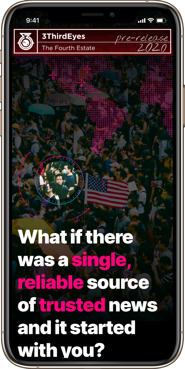
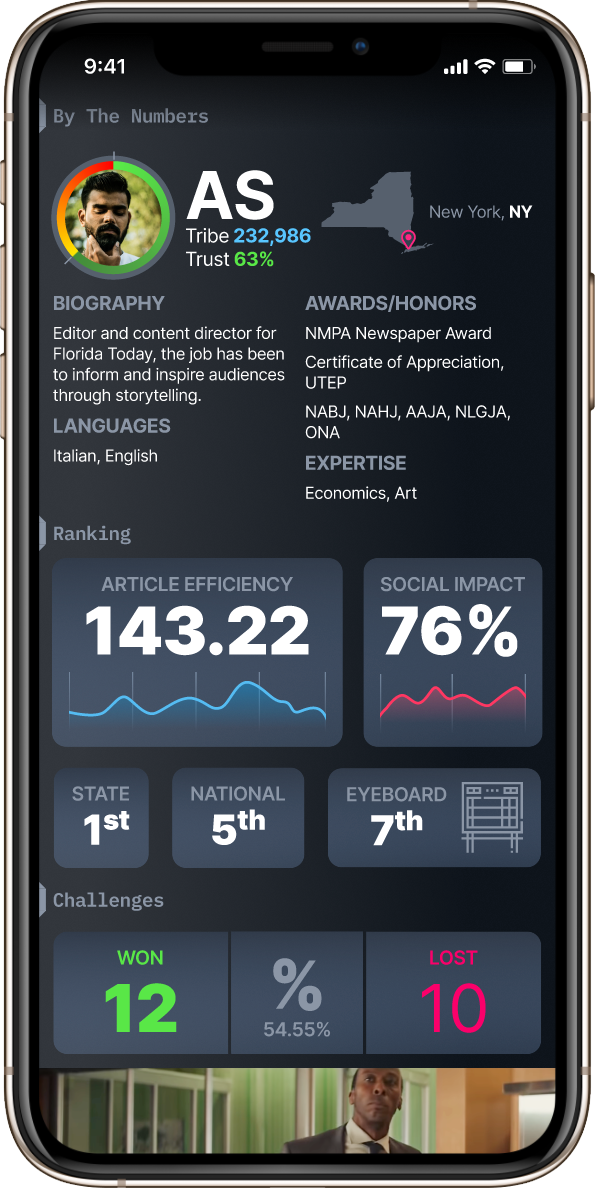
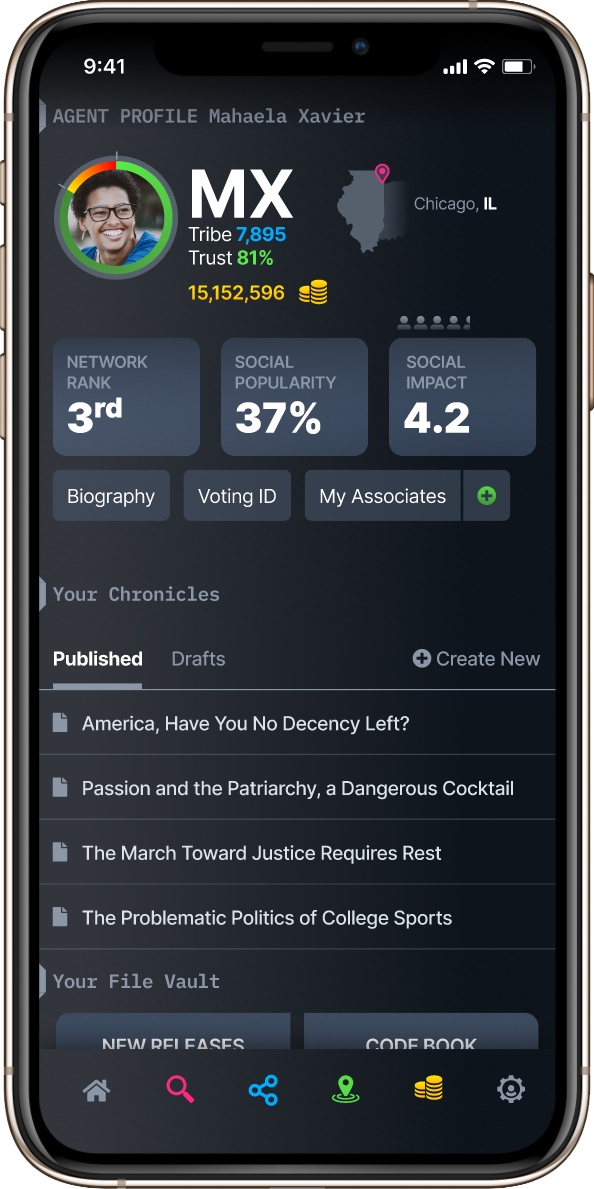
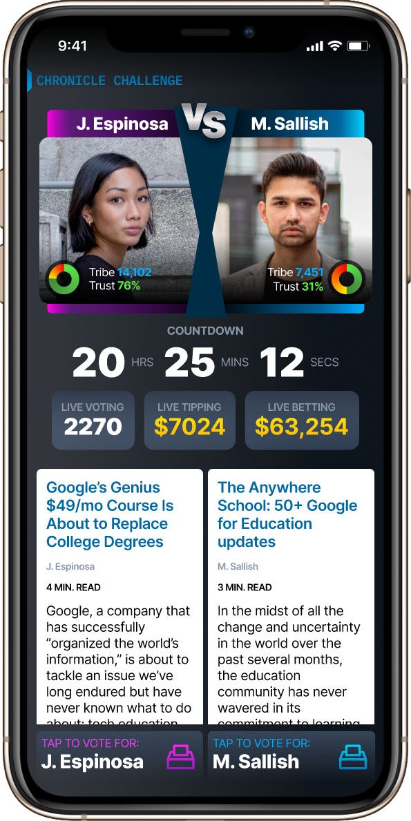
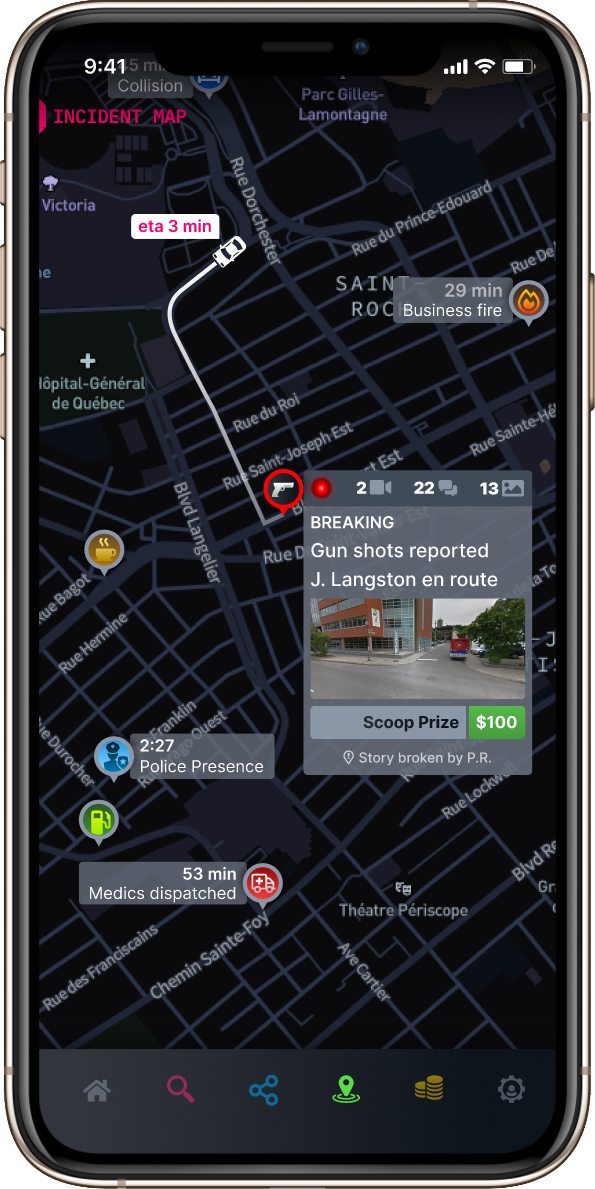
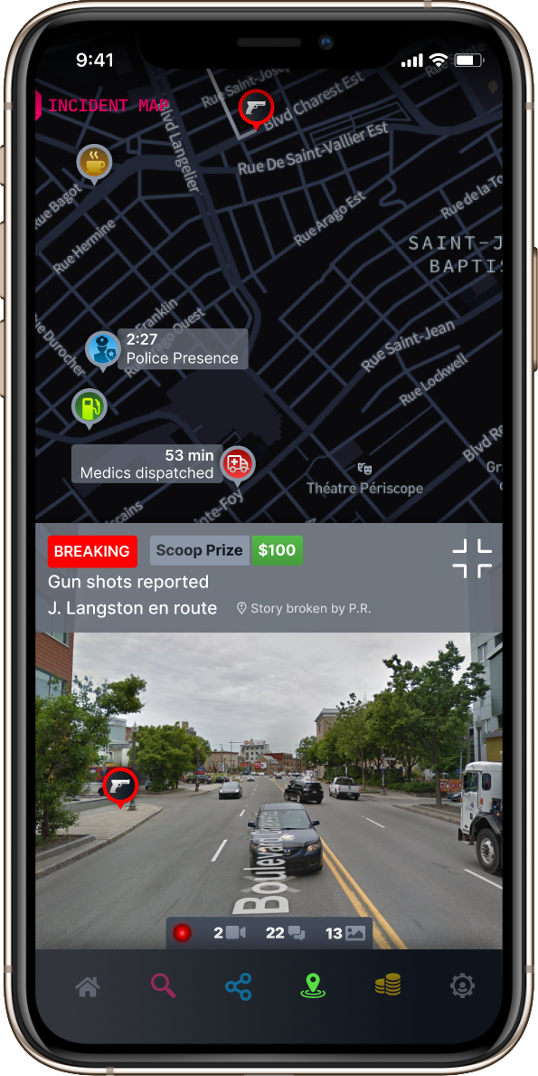
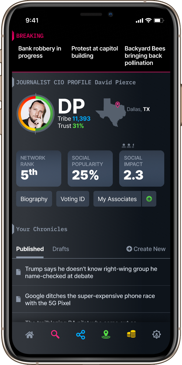
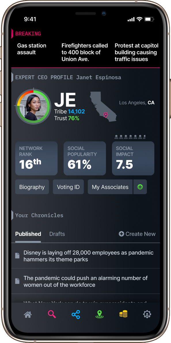
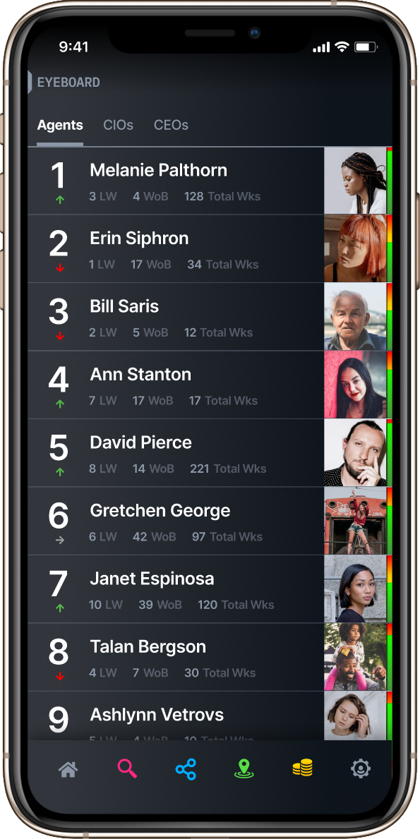
This is a Proof of Concept for a live-action on-the-go community reporting app. I thought I would include it here since it is immersive in the experience of providing professional and community reporters access to information that can help them identify and provide live updates on breaking news to help validate whether mainstream news sources are providing accurate information.
This is a Proof of Concept for a live-action on-the-go community reporting app. I thought I would include it here since it is immersive in the experience of providing professional and community reporters access to information that can help them identify and provide live updates on breaking news to help validate whether mainstream news sources are providing accurate information.
It includes some gamification elements to make journalism more relevant and interactive.
MARS NEEDS MOMS
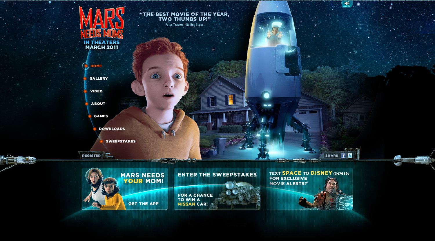
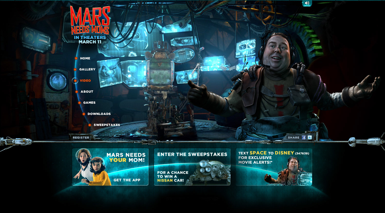
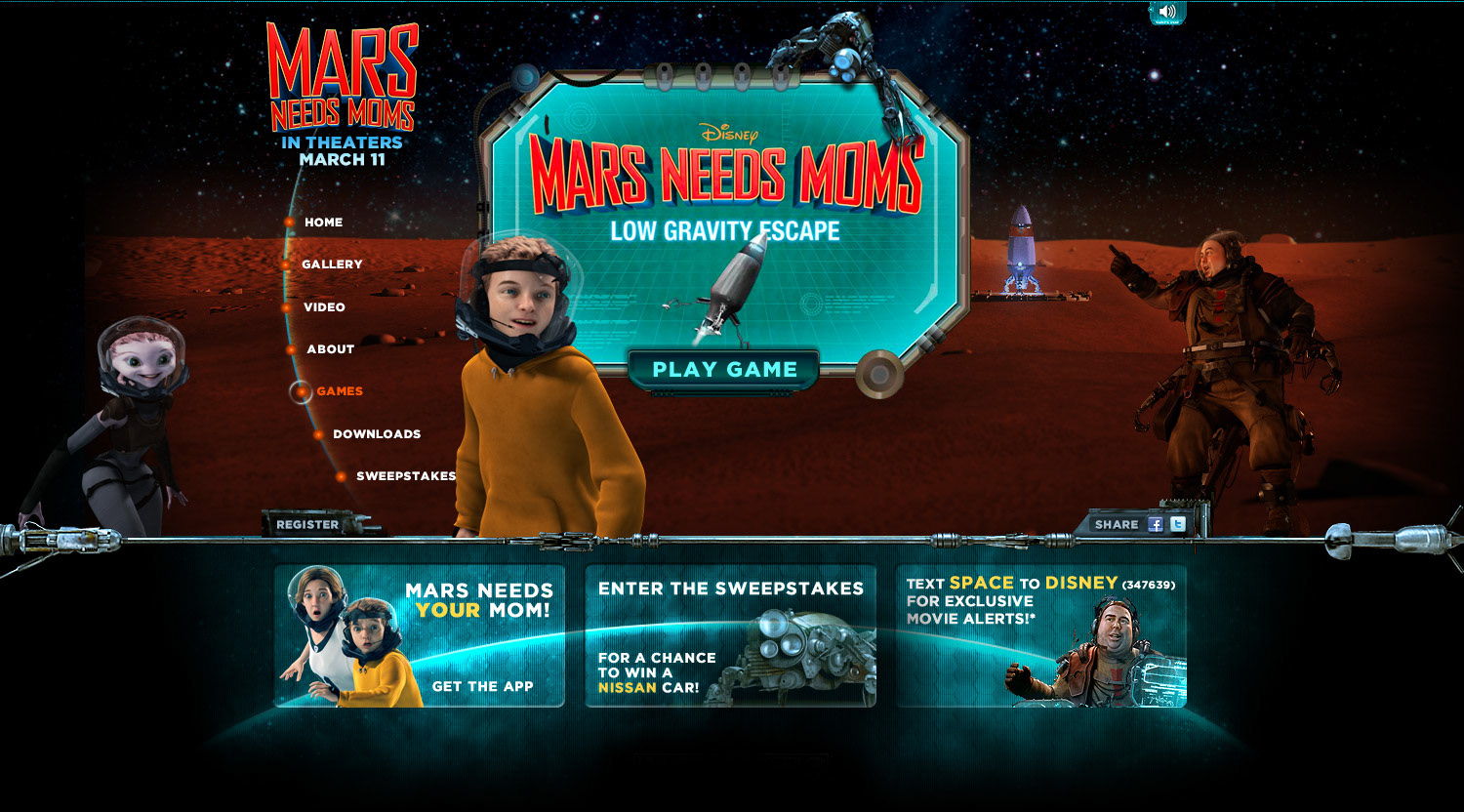
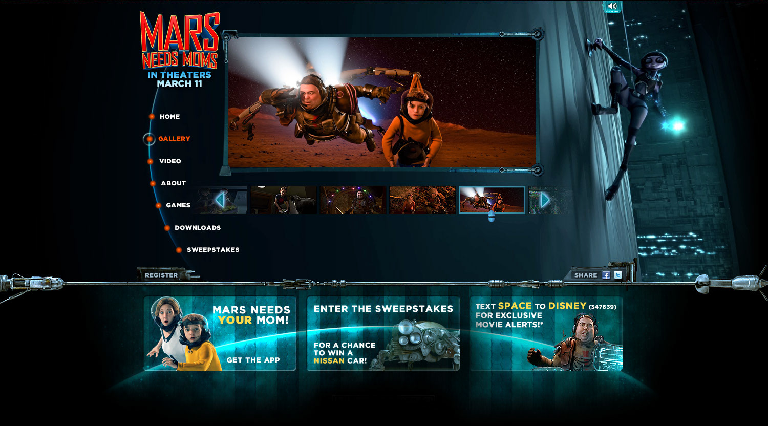
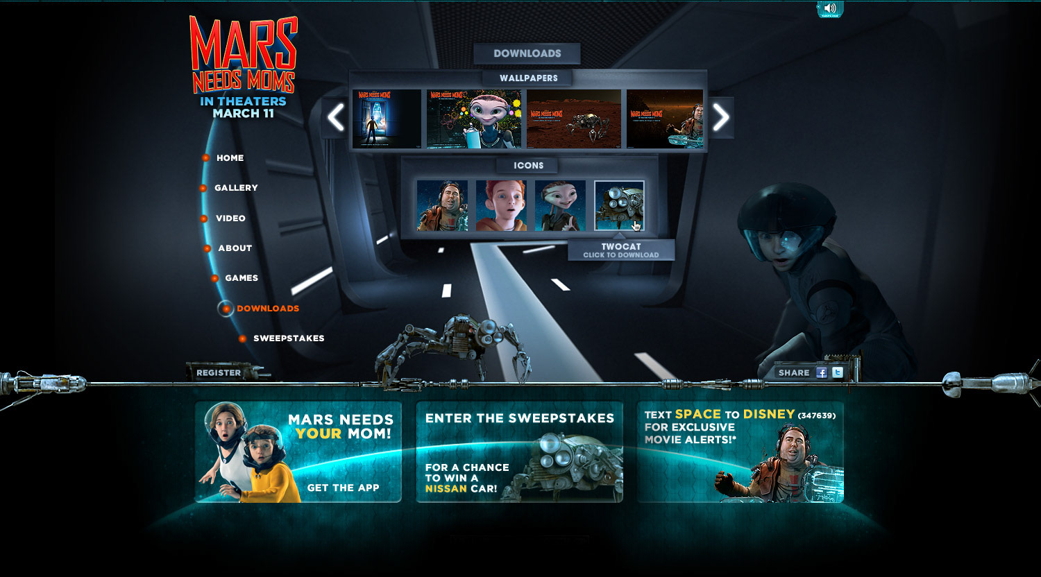
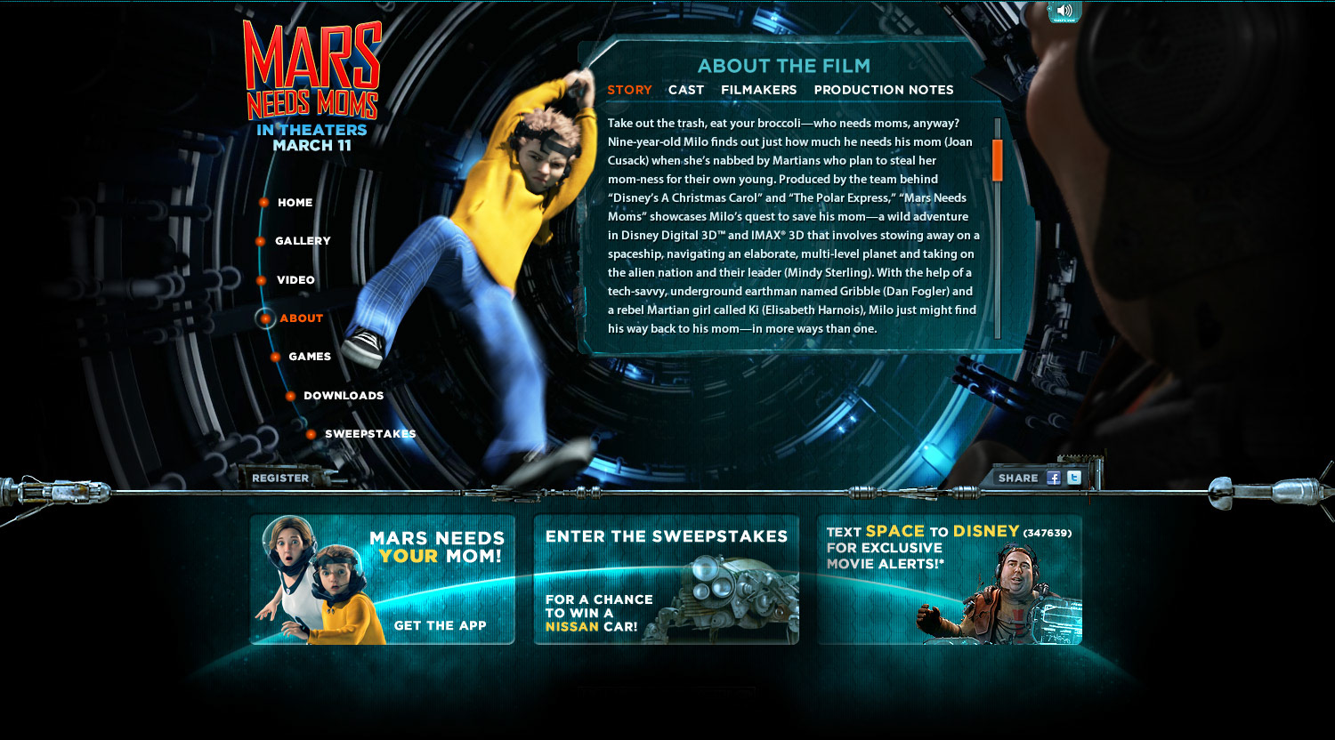
One for the kids! In building the animated experience for Mars Needs Moms, I wanted to integrate elements of the 3D used in the film. If you watch the short video below, you'll see how the spaceship flew off the homepage (at about 26 seconds in), which was one of many little elements that popped off the page to make this a fun and engaging journey for the Disney audience.
One for the kids! In building the animated experience for Mars Needs Moms, I wanted to integrate elements of the 3D used in the film. If you watch the short video below, you'll see how the spaceship flew off the homepage (at about 26 seconds in), which was one of many little elements that popped off the page to make this a fun and engaging journey for the Disney audience.
